Quantcast
Channel: Cambridge Intelligence
Viewing all 499 articles
Browse latest View live

KeyLines News – April 2014

$
0
0

Welcome to our April edition of KeyLines News – our occasional collection of our news, content and goings-on.

This edition comes as we settle into our sleek and shiny new office in Cambridge; make sure you come to visit if you’re ever in town.

Visualizing the Neo4j Graph Database with KeyLines

Last month, we joined our friends at Neo4j for a webinar on visualizing the Neo4j graph database with KeyLines. If you didn’t get a chance to join us, watch a recording below. Neo4j fans can find other visualization resources on our Neo4j webpage, including an introduction video and Getting Started guide.

Top content

Company news

We were recently named one of the EverLine Future 50, and nominated for the Business Weekly award for International Company of the year. Read more about our awards here.

Jobs

As KeyLines’ popularity continues to grow, so does our team. We’re hiring for new developer roles to join us in the UK. See our job vacancies.

Upcoming events

We’ll be speaking and exhibiting at a few events in the coming months. Come and meet us if you can:

Best wishes

The KeyLines team

The post KeyLines News – April 2014 appeared first on .


Visualizing Cyber Security Threats

$
0
0

It won’t have escaped your notice that cybercrime has become a permanent headache for many organizations.

As IT networks increase in size and connectedness, they have also become more vulnerable to malicious activity. Organizations relying on data, information and intellectual property are especially at risk, with high profile attacks hitting several global organizations.

Data-led cyber security

Cybersecurity professionals can ensure greater resilience using a data-led strategy. Existing SIEM and SEM cybersecurity tool providers have invested heavily in dashboards – tools for collating cyber data from across the organization and presenting it in a single view.

What’s often missing, however, is an efficient and effective way to visualize this connected data.

Free download: Network visualization and cyber security

We’ve put compiled a new white paper, explaining how existing KeyLines customers have used our tool to enhance their cybersecurity data activities.

Using screenshots of demo applications built using the KeyLines toolkit, we explain how you can deploy network visualization to:

  • Maintain a secure perimeter
  • Monitor for emerging threats
  • Perform efficient post-attack forensics

Download White Paper

The post Visualizing Cyber Security Threats appeared first on .

Visualizing a CrunchBase network in KeyLines

$
0
0

As a young technology company, we’re big fans of CrunchBase – the crowd-sourced database of start-up companies, entrepreneurs and products. You can even find us on there…

Just last week, following months of development, CrunchBase 2.0 was announced. The most noticeable difference is in the new responsive page design, but the biggest change is behind the scenes – the creaking relational backend has been replaced with a shiny new Neo4j graph database – making queries faster and opening up new levels of extensibility.

The Business Graph, as it has been named, features 530,000 connected companies and people. In a Neo4j graph database. With a free (and easy to use) API.

Visualizing it in KeyLines seemed the obvious next step.

We’ve made some notes to help show you how simple it is to build a fully-customized data visualization application with KeyLines. To get an evaluation and try it for yourself, just get in touch.

Getting Started

1. Access the CrunchBase API

First you’ll need to familiarize yourself with the CrunchBase developer portal and request an API key, which is needed to call data from the Business Graph, using CrunchBases’ RESTful interface. You can register here: http://developer.crunchbase.com/member/register

The team at CrunchBase have done a great job with the API and have also provides a nice web documentation interface; so, once you have your API key you can test their API here: http://developer.crunchbase.com/io-docs.

2. Download KeyLines

Once you have your login details for the KeyLines SDK, we recommend taking some time to read the Getting Started documentation and downloading the relevant files.

We’re going to assume you’re working in a Canvas-compatible browser and only need to download our JavaScript files. But if, for whatever reason, you find yourself on a machine with only IE7 installed, you will also need to download the Flash file.

This code snippet shows a very simple KeyLines “hello world” example.

<!DOCTYPE html>
<html>
  <head>
    <!-- Load the KeyLines file -->
    <script src="keylines.js" type="text/javascript"></script>

    <!-- Other libraries we want to use, e.g. jQuery -->
    <script src="jquery.js" type="text/javascript"></script>     
  </head>
  <body>
    <!-- This is the HTML element that will be used to render the KeyLines component -->
    <div id="chartID" style="width: 400px; height: 300px;" ></div>
     
    <!-- This is the actual code to load KeyLines in the page -->
    <script>
      var myChart;            // This will store a reference to our KeyLines chart object
      var myChartItems = [];  // This array will store our node and link definitions

      // wait until the fonts are loaded to start
      $(window).load(function () {
        
        // Set the path for the assets
        KeyLines.setCanvasPaths(‘assets/’);
         
        //load the component: specify the id and callback
        KeyLines.createChart('chartID', chartReady);
      });
         
      function chartReady (err, chart) {
        // Store a reference to the KeyLines chart object
        myChart = chart;

        // Use our helper functions to add the node and link definitions
        addNode('id1', 'Hello','#B9121B');
        addNode('id2', 'World','#B9121B');
        addLink('id1', 'id2', '', '#4C1B1B', false);

        // Load the chart with the newly defined nodes and links
        myChart.load({
          type: 'LinkChart',
          items: myChartItems
        });
      }  
 
      // Helper function to add a new node definition to our chart items array
      function addNode(nodeId, nodeTitle, colour){
        myChartItems.push({c: colour, id: nodeId, t: nodeTitle, type: 'node',x: 100, y: 100
            });
      }

      // Helper function to add a new link definition to our chart items array
      function addLink(nodeId1, nodeId2, linkTitle, colour, directional){
        myChartItems.push({a2: directional, c: colour, id: nodeId1 + '-' + nodeId2,
              id1: nodeId1, id2: nodeId2, t: linkTitle, type: 'link'
            });
      }
    </script>     
  </body>
</html>

In this example, we’re carrying out the following actions:

  • Loading our webpage
  • Creating a KeyLines chart object
  • Adding data definitions to our chart object (using the helper functions addNode and addLink)
  • Loading the chart with these item definitions

Which should display a simple little chart like this:

Link CrunchBase with KeyLines

Now we have our basic infrastructure in place, we need to get KeyLines pulling data from CrunchBase. To do this we:

  • Issue a request through to the CrunchBase API and get a response
  • Parse the response into KeyLines’ node-link JSON format
  • Display the results in a KeyLines chart

Step 1: Issue a CrunchBase API Request

We can call data from the Business Graph using the CrunchBase API’s Entity Information Request. There’s an I/O docs interface on their developer site you can use you test this:

The above example will request company information on ‘facebook’. The Request URI for this would be:

http://api.crunchbase.com/v/1/company/facebook.js?api_key={your api key}

The response we get back is in the format of a JSON object – easily manipulable with JavaScript, so perfect for KeyLines. To generate this URI, we use the following code:

  function getEntityUrl(entityType, name) {
      return 'http://api.crunchbase.com/v/1/'
      + encodeURIComponent(entityType)
      + '/
      + encodeURIComponent(name)
      + '.js?api_key='
      + apikey;
  }

Now, we need to add the actual request mechanism, using the jQuery $.ajax method:

function getEntity() {
        var cbUrl = getEntityUrl('company', 'facebook');
        $.ajax({
            url:      cbUrl,
            dataType: 'jsonp',
            success:  function(data){
                        parseResponse(data);
                        myChart.expand(myChartItems, {fit: true, animate: true, tidy: true});
                      }
        });
      }

Here we’re making an Ajax request to the generated URL. As this is requesting data from another domain we need to use JSONP (JSON with padding). If the request succeeds then the success callback option is invoked. The callback function will receive the response object returned by the server. This response is then parsed and KeyLines renders the objects.

Step 2: Parse the Response

      function parseResponse(data){
        
        // Get the main company and us this as it's ID
        var mainCompanyId = data.permalink;

        // Add the main company node to the chart
        addNode('company', mainCompanyId, data.name, '#B9121B');

        // Parse Competition
        if(data.competitions.length > 0)
        {
            for (var i = 0; i < data.competitions.length; i++)
            {
                var competition = data.competitions[i];
                var competingCompany = competition.competitor;
                var competingCompanyId = competingCompany.permalink;

                // Add the competitor company node
                addNode('company', competingCompanyId, competingCompany.name, '#B9121B');

                // Now add a link from our main company to the competitor
                addLink('company', mainCompanyId, 'company', competingCompanyId, 'Competitor', '#4C1B1B', false);
            }
        }
        // Todo: Parse Company Personnel 
        // Todo: Parse Acquisitions
        // Todo: Parse Funding
        // Todo: Parse Investments
      }

This function is reasonably simple and relies on two other helper functions (similar to the addNode and addLink functions in our original ‘hello world’ example) to actually add the nodes and link information to an array of chart items.

Step 3: Display the KeyLines Chart

Now that we’ve parsed the response to our our original request and added the resulting items to the chart structure, all we need to do is display the chart. The code for this is already in our .success callback from the original Ajax request.

myChart.expand(myChartItems, {fit: true, animate: true, tidy: true});

This sends the newly created chart items to the chart object with some instructions for the layout.

Steps 4 onwards...

So, there it is. In just a short amount of time, it’s possible to pull data from the Business Graph and start displaying it in KeyLines.

Next you will probably want to start playing with how the design of your graph, adding new layout options, extending the user interface to explore data incrementally.

You can also use the CrunchBase API to pull more extensive data on each company - like their employees, products and acquisitions.

With a small amount of coding, it’s possible to extend and enrich not just the visual user experience, but also add value to the data you are exploring with advanced visual analysis.

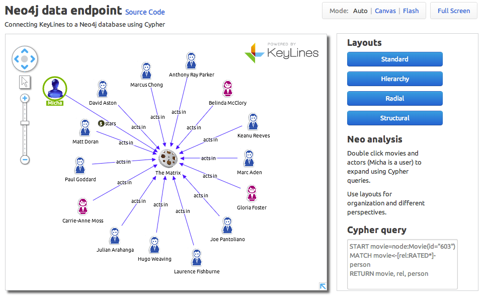
We’ll cover some of those options in later blog posts. For now, here’s an example of what you could achieve:

The post Visualizing a CrunchBase network in KeyLines appeared first on .

KeyLines version 1.17

$
0
0

Earlier this week we launched our April release of KeyLines: version 1.17. Below is a quick overview of the new features available that are available now in the KeyLines SDK.

New Feature: Halos

These eye-catching new design features could be used to signify an event on a node, like an alert or flag, or help your users find a starting point. They’re simple to add and are fully documented on the Object Format section of the SDK (Documentation > Object Formats).

They can also be easily animated, using the new chart function called ‘Ping’, which draws the halo, animates it and then removes it again.

The result is something like this:

 You can add up to 10 halos per node, and you can define their color, weight and diameter. See the new Animation demo (Demos > Animation) and Ping Function (Documentation > API Reference > Ping) to see how it works.

New Feature: Dashed and dotted lines

These are perfect for the times you need to show suspected or weak connections between nodes.

dashed linesYou can see both of these examples in the Styles demo (Demos > Styles) and documentation can be found in Documentation > Object Formats > Links.

Note that these are both only supported in more modern browsers (IE11, Firefox 7+, Chrome (any) and Safari 6+).

New demos

We’ve updated our Neo4j demo to support Neo4j 2.0, including a ratings function. If you have access to the SDK, you can find this under Demos > Neo4j, where you can inspect the source code.

We’ve also updated our Animation demo to include halos. Make sure you go and take a look and check out the source code.

Queued animation

One minor update is that we’ve added the ability to run multiple animations concurrently (rather than having to wait for one animation to finish before the next can start). For details see ‘animateProperties’ in the API reference.

Improved documentation

All of the new functionality has been fully documented, plus we’ve added new guidance on how to pull images from a different origin to the KeyLines.js file. Go to Documentation > Cross-Origin Images to take a look.

Bug fixes

Finally, we’ve tweaked some positioning and browser compatibility issues, and fixed a few customer-specific bugs. More information is available in the Change Log section of the SDK.

If you have any questions about any of the changes we’ve made, to report bugs or to request new features, just get in touch.

The post KeyLines version 1.17 appeared first on .

JavaScript in the Real World

$
0
0

This is the first in a series of posts written by KeyLines’ developers on the subject of JavaScript in the real world. This week, KeyLines Developer Phil Rodgers runs through his favorite modules.

We are huge fans of JavaScript. As the scripting language of the Internet, it’s the obvious choice for developers looking to build powerful and scalable web applications that enjoy the flexibility and cross-machine compatibility users demand.

Using JavaScript and NodeJS, KeyLines provides the same power and functionality that would previously only be possible using desktop applications (and their installation headaches) or Java applets (and their on-going security risks).

In this post, we’re going to introduce the modules we’ve used to build KeyLines’ powerful JavaScript data visualization toolkit.


But first, why Node?

node.js-hostingWell, we’ve found it to be a great platform for building server-side applications. As it uses the same Google V8 JavaScript engine that powers the popular Chrome browser, we can reuse our front-end JavaScript skills to write back-end code too.

It also provides a package manager, npm, that gives easy access to the vast range of packages that run on the Node platform.

Visit the NodeJS website: http://nodejs.org/


express

Express is one of the most popular Node packages. It’s a web application framework – a powerful and flexible way of defining what web servers should do. You can write a basic web server with just a few lines of code, or implement more complex behavior in a straightforward and expressive way, by defining how middleware should process web requests.

We use Express to power the KeyLines SDK website that our customers use to build their network visualization applications.

Visit the ExpressJS website: http://expressjs.com/


jade

Another useful Node package is Jade, which is a powerful templating engine. At its simplest, it lets you write HTML in a clear and stripped-down way, without an angle bracket (or forgotten </div> in sight. But it also offers control structures like loops and conditionals, and powerful templating features that give you a lot of flexibility in building web pages. We use it extensively on our SDK website.

Visit the Jade language website: http://jade-lang.com/


jshint

JSHint is a JavaScript code quality tool – it analyses JavaScript code looking for errors and potential problems. It’s based on Douglas Crockford’s JSLint, but as its name suggests, it’s less opinionated as well as being more configurable. Running JSHint can be a big timesaver, as it can often identify problems that would take a lot of debugging to track down.

Visit the JSHint website: http://www.jshint.com/


Requestjs

Request is a very useful Node package that provides a simple way to make HTTP calls to other servers and process the results, dealing with a lot of the complexity for you. It’s particularly useful if you need to set up a proxy to another server to avoid problems with cross-origin resource sharing – when browser security stops resources from one web server interacting with those from another.

Visit the RequestJS website: http://www.npmjs.org/package/request


Google-Developers-LogoLurking beneath the surface of Google’s Chrome browser is an incredibly powerful set of development tools. They let you debug JavaScript code, inspect the structure of web pages, understand how styling is affecting your page, see how well caching is working, analyze memory usage, and do many other things besides, with new features constantly being added in Chrome’s frequent updates. While other browsers also have very capable development tools, at the moment Chrome’s tools are our favorites.

Visit the Chrome Developers tool website: http://developers.google.com/chrome-developer-tools/


Have we missed any out?

Let us know in the comments section below to suggest a package you think we should take a look at.

The post JavaScript in the Real World appeared first on .

KeyLines arriva a Roma!

$
0
0

marco2If you’re lucky enough to be in Rome at the end of May, why not join KeyLines’ developer Marco Liberati for the Big Data & Graphs event, hosted by Orient Technologies?

Taking place at Roma Tre University, the free afternoon event will cover various aspects of graph databases, including a talk from Marco on how to interact with your graphs using KeyLines.

The event has already sold out BUT there are 40 additional tickets available on the day, or a waiting list available.

Update: Additional free tickets have now been released. Reserve your place before they run out.

  • Venue: Terza Università degli Studi di Roma – Via della Vasca Navale, 79 – Roma.
  • Date: 30 May 2014
  • Time: 14:00 – 19:00

Find out more on Eventbrite.

Ci si vede lì !

The post KeyLines arriva a Roma! appeared first on .

Neo4j 2.0 and KeyLines

$
0
0

Fellow fans of the open-source Neo4j graph database will, by now, be pretty familiar with Neo4j 2.0.

December’s major release was a big leap forward for the world’s most popular graph database, bringing a host of improvements and enhancements, including:

  • A more concise and declarative Cypher query language
  • A hugely improved Neo4j Browser – a great d3.js tool for developers who need to visualize their data model
  • The addition of labels to the data model

Nothing that KeyLines relies upon was deprecated in the release, so any deployments of KeyLines running from a Neo4j database were virtually unaffected (excluding a need to migrate from the 1.x data format, obviously).

But the addition of those labels opens up new opportunities to KeyLines/Neo4j users.

Using Neo4j labels for visualization

Neo4j is a ‘schema optional’ graph database. Whilst this has it’s benefits in terms of extensibility, it has had a negative effect on overall performance.

The addition of labels as indexed properties provides a hybrid solution. It keeps the flexibility of the graph model, but still offers a fast way to store and query the attributes of data entities.

For KeyLines applications, this means the developer no longer needs to infer a style from several different properties, but can instead simply have a ‘per-label’ template for your visualization.

For example, our demo uses the (now ubiquitous) Matrix IMDB data. Here’s how it used to look:

Old Neo4j KeyLines demo

The color of the node represents the gender of the actor referenced. To do this with Neo4j 1.x, each node needed a property for gender, role (actor, director, etc) and more:

START m=node(89)
MATCH m<-[r:ACTS_IN*]-a
RETURN m, r, a

With labels, we can now simply tag each node with Actor, Movie or Director and gender tags. As labels are indexed, it means queries can filter nodes with those properties directly, resulting in much faster (and more readable) queries with cleaner results:

START m=node(89)
MATCH (m:Movie)<-[r:ACTS_IN*]-(a:Actor)
RETURN m, r, a

If you want to use labels to style the nodes we’re retrieving we can tweak the Cypher query to return labels as well:

START m=node(89)
MATCH (m:Movie)<-[r:ACTS_IN*]-(a:Actor)
RETURN m, labels(m), r, a, labels(a)

Labels can also be added to edges, meaning we can easily add labels to the links in our KeyLines chart. For example, adding the name of the character each actor played in a movie.

We can also tag our movie with a label then, by binding it to a document store of movie posters, we can easily and more quickly pull in the poster of each title:

Neo4j demo

The use of style templates together with labels can help to write more concise and readable code:

function styleNode(node, labels){
  if( isActor(labels) ){
    addActorStyle(node);
     // Use style templates for genders
    if( isMale(labels) ){
      addMaleStyle(node);
    } else {
      addFemaleStyle(node);
    }
  }
  if( isMovie(labels) ){
    // the addMovieStyle works out the URL for the movie poster
     // and add an oscar glyph if the movie won any
    addMovieStyle(node);
  }
  return node;
}

There it is. A simple change, but one that offers fresh opportunities to add more contextual information to your chart quickly and easily.

Get in touch if you would like any help or would like to evaluate the KeyLines SDK.

P.s. You can persist back to the database

Just a footnote for users of the KeyLines SDK… we’ve also added some source code to the Neo4j demo that explains how to write back to the database. It’s a simple operation, but a useful one!

Get Started with KeyLines and Neo4j

Want to know more about how KeyLines and Neo4j work together? Download our getting started guide:

Download Guide »

The post Neo4j 2.0 and KeyLines appeared first on .

The problem with fraud detection…

$
0
0

Calculating the cost of fraud is a fairly futile undertaking.

One estimate, from a 2012 report by the Association of Certified Fraud Examiners, puts global fraud losses at $3.5 trillion each year. The reality, though, is that nobody really knows the impact of fraud. Its deceptive nature means much of it passes beneath the radar and is never fully detected.

Over the past decade, the financial services industry has invested heavily in using ‘big data’ and data analytics in their fight against fraudsters. Automated systems scan and score every transaction, claim and policy to detect anomalies and uncover potential cases of fraud.

Although this process is infinitely more secure and robust than previous methods, the data-driven approach is resource-intensive and contains many weaknesses for fraudsters to exploit.

Our latest white paper shows how sophisticated network visualization can be deployed as part of a fraud detection platform, creating more efficient processes and a more effective fraud management effort.


Detecting Fraud with Network Visualization

Using real use cases from KeyLines customers, this white paper shows how network visualization can be used as part of a wider fraud management effort to increase efficiency and effectiveness.

Download White Paper »


The post The problem with fraud detection… appeared first on .


Detangling Patents with KeyLines

$
0
0

Some of the world’s largest organizations have placed IP at the heart of their business strategy.

Understanding your IP and the IP of your competitors is key insight, driving everything from R&D and product management to competitor landscaping, acquisition plans and even staff recruitment. Often, IP is held in the more tangible form of patents.

The complexity of patents

Sadly, keeping track of patents is far from a simple task. In 2012, the number of patents increased by 9.2%, bringing the number of patents in force at the 100s of patent offices worldwide to 8.66 million.

Then there’s the complexity of modern patents (and their lengthy descriptions) themselves. Many patent authorities simply lack the number of qualified investigators needed to work through the volume of applications made.

In 2012, the US Patent and Trademark Office approved 90% of all applications, with some concluding that investigators were just making cursory searches before approval and leaving assignees to fight it out in court afterwards.

With all this conflict, confusion and corporate money in the air, we can see how IP has become a goldmine for lawyers and ‘patent assertion entities’ (patent trolls to the rest of us).

Simplifying patents with networks

In this blog post, we’re going to look at how we can help companies simplify patent data using a network-based approach. Understanding patents is a matter of understanding connections – especially those between inventors, assignees, classifications and the patents themselves:

  • An inventor is normally the person principally responsible for the innovation being patented
  • An assignee is the owner of a patent; often the organization for which the inventor was working at the time the patent application was filed
  • A classification is the category into which the patent was filed, usually according to the technical features of the innovation.

Visualizing patent data as a network or graph

Mapping this data as a connected network provides valuable insight into which individuals and organizations are present in which areas, and which areas are under-controlled.

Using an API to the EPO database, we’ve put together a KeyLines demo visualizing some patent data…

Introducing Networks – Download the KeyLines White paper

The ‘Big Pharma’ patent war

Two companies that have been getting a lot of attention in the UK and US are pharma giants Pfizer and Astra Zeneca.

Pfizer’s recent $119bn takeover attempt may have been driven by significant tax benefits, but the company also were surely motivated by an impressive patent portfolio… In an environment where a single drug can cost $4bn to develop (and create over $100bn in revenue), it’s important understand the IP landscape.

Here’s a network of the last 600 patents registered by the EPO with Pfizer or Astra Zeneca as the assignee. It’s a bit of a tangle at first:

Visualizing patent data 2

But when we look at connections between assignees and classifications (color coded by category) a much more coherent picture emerges:

Visualizing patent data 2

We can see by the huge number of ‘shared’ category nodes between the different assignees that the two companies compete directly in core areas. For Pfizer, buying that competitor, plus their vast portfolio of relevant patents, would be significant advantage.

Further, in the top-left we can see a fan of categories AZ in which Pfizer have not recently registered patents. This could indicate unique strengths in AZ’s R&D program from which Pfizer could benefit.

Google X: Buying good inventors

Another motivation for understanding the patent landscape is to identify the industry experts. An example of a company doing this is Google.

For the past 4 years, a semi-secret department of Google (the futuristic sounding ‘Google X’) has been acquiring promising tech companies and subsuming their tech into Google’s product portfolio.

As many of the companies are young and small, it’s probably fair to say the employees’ expertise & patents were of more interest than the companies’ revenue.

Let’s take a look at a few of the latest acquisitions and registered inventors:

Visualizing patent data 2

Both the inventor nodes and links are sized by number of patents registered at the EPO.

Nest appears to be a good acquisition choice. The company includes a large number of inventors, including 4 serial inventors – identifiable by the significantly heavier links. Their patents also span at least 5 different categories.

Likewise, Mankani Power (in the lower right-hand side) has a good number of inventors working across several areas.

Boston Dynamics in the top left, seem to have patents focused in one single area, but have collaborated with Sony Corporation. For the rest, on paper, they seem less exciting with only a few inventors between them – all in the same category.

Visualize your own patent networks

Visualizing patent data in this way gives instant access to meaningful, useful information.

If you would like to see a full working demo of KeyLines, just get in touch:

The post Detangling Patents with KeyLines appeared first on .

KeyLines News – June 2014

$
0
0

Welcome to June’s KeyLines News – your occasional round up of news, articles and goings-on.

We’ve had a busy couple of months, settling into our new offices, celebrating our third birthday and releasing a new version of the KeyLines toolkit. Read on for more…

New white papers

Our latest white papers show examples of how KeyLines customers have deployed the toolkit to solve their real-world data visualization problems. Download them here:

Top 5 blog posts

Releases & new features

KeyLines 1.17 is out, and includes some awesome new features, like halos, pings, dotted links and some new demos.

We’ve covered the main points in this blog post.

Come and work with us!

We’re currently looking for four new team members to join us in Cambridge, UK. If you want to work for a fast growing, exciting new company (and enjoy #fastfoodfriday) get in touch!
The vacancies are listed here.

The post KeyLines News – June 2014 appeared first on .

Where Technology & Fraud Prevention Collide

$
0
0

The UK’s fraud prevention community descended on the city of London earlier this week for CIFAS’ annual conference, ‘Where Technology & Fraud Prevention Collide’.

The packed agenda included leading thinkers and top names from across the industry, focusing their talks on the use of technology to protect us all from the threats of fraud.

The KeyLines team was one of several exhibitors showcasing the latest in anti-fraud data analytics technology, vying for the attention of the attendees from CIFAS’ 300+ member organizations and beyond.

Fighting fraud with technology

The day began with some scary statistics from Chi Onwurah MP:

  • Fraud costs the UK public sector £20bn per year
  • 1 in 4 of us will suffer from loss of data
  • 1 in 10 will suffer identity fraud

But despite these risks, she implored the audience not to stifle the benefits of technology but still to be aware of ‘digital discomfort’ – the unease the public has of too much data being made available.

Next on stage was Andrew Carter – Senior Manager of Organised Crime Intelligence at Nationwide. In a fascinating presentation, he outlined the banks impressive anti-fraud operations, focusing on prevention, investigation and the inside threat. One tactic he highlighted was gangs of fraudsters calling banks knowing only their victim’s name and date of birth – from there they can work outwards to piece together the data they need to attack.

Last in this session was Chris Brauer of Goldsmith’s, University of London. With the first of several mentions of ‘Moore’s Law’, he described the imminent ‘singularity’ event, when machines become cleverer and faster-evolving that humans.

Let’s just hope they’re benevolent.

We’ve seen the future of fraud… Be afraid!

The morning continued with selection of talks looking into the future of fraud.

Gregory Henwood of the Biometrics Institute introduced the possible benefits of more widely using technologies like fingerprint verification and face recognition to prevent fraud and other crime. One interesting stat mentioned was that 60% of all fraud has a ‘touch point’ with a call center – equipping staff with voice biometrics could have a massive effect on fraud prevention across the industry.

Next up was Richard Brown of IBM, speaking on one of our favorite topics: bitcoin. Richard introduced the concept of a peer-to-peer transaction system, the impact of which was not lost on an audience mainly from the financial services. He then finished with an observation that bitcoin’s model is bringing new innovations that anti-fraud professionals could benefit from implementing themselves.

Wrapping up before lunch was Bournemouth University academic, Christopher Richardson. We can only assume his aim was to instill as much fear into the audience as possible. It worked. Christopher emphasized the threat of fraudsters profiting from the chaos of cyber insecurity, with the scale of attacks due to only increase.

Getting the most of technology and data

Taking the difficult ‘post lunch’ slot was the engaging double-act of Neil Patrick and Jim Oakes from Wynyard Technology. The pair spoke of a complex world “awash with data”, where connections and networks are everywhere and the best technologies need to be deployed to make sense of it all.  The key message was the importance of implementing evolving, multi-layered solutions capable of meeting the challenges both today and tomorrow.

Next up was one of the most engaging talks of the day, by Luke Spikes – Chief Data Alchemist at Zantica. He won over most of the crowd immediately by declaring a genuine love of data. His talk then explained the methodology and results of a recent consultancy project for the UK government, aiming to improve grant fraud detection. Unfortunately he didn’t share the 124 ‘red flags’ he identified that demonstrate a raised risk of fraud, but he did revive a flagging audience after a good lunch.

The early afternoon session ended with a flying visit from Andy Archibald, Deputy Director of the National Cyber Crime Unit and a man very much in demand this week. The presentation started with a shocking fact – on average, a cyber threat is present on a victims’ network for 229 before detection. Andy then explained the remit and activity of the NCCU, highlighting the massive skills gap the UK faces in the field of cybersecurity.

On that note, it was for more coffee and cake.

Ending on a high

Claire Brunt, member relationship manager for CIFAS, opened the last session with some insight from her 15 years experience of fraud analytics. Everyone enjoyed her ‘join the dots’ analogy, emphasizing the importance of a complete data picture to truly understand a case,

Claire’s key message was of the importance of a keeping a centralized layered approach for fraud data, providing an example of identifying an elusive fraud ring by identifying browser cookies.

Next up was Barry Coffey of Addleshaw Goddard, offering valuable information on the legal course of action available when pursuing cyber security breaches, data loss and fraud. He described some of the common issue and in particular the varying privacy and data protection laws across the globe.

And last, by definitely not least, was Michael Driscoll, assistant legal attaché with the FBI. In another frightening talk, Michael explained botnet and DDoS attacks, describing how how cyber now underpins all crimes and that cross-border collaboration is becoming a mandatory requirement to resolving these attacks.

Michael provided some background into the recent successful arrest of the Gameover Zeus ringleader; but left us in no doubt that this was a present and growing threat.

The days clear message:

As the delegates started their journey’s home, they had plenty to think about. The clear message from all of the speakers was this: The threats we all face are changing – and fast – all organizations need to be deploying the best technologies to ensure they stay one step ahead.

Many thanks to the CIFAS team, the speakers and our fellow delegates for a stimulating and enjoyable event.

The post Where Technology & Fraud Prevention Collide appeared first on .

Visualizing data with HTML5 Canvas

$
0
0

HTML5_Logo_512The Canvas element is the part of the HTML5 language that lets you render 2D images and shapes dynamically. It’s a great way to visualise your data (and is how KeyLines renders graphics in a browser) but it’s only part of the story.

Being able to draw things is just the first part of any web-based data visualization project: you also need to add interactivity, compositing images, hit testing and animation.  So how do you do it?

Luckily for developers, modern browsers have all the answers.

Create multiple canvases

You can create as many HTML5 canvases as you like – dynamically. As with most things, Internet Explorer is a bit slow making them, especially the older versions, but other browsers are very quick. Using multiple canvases at once, you can composite images, manipulate pixels and perform other animation tricks. Your imagination is really the limit.

Hook into the game loop

So now that we can draw our data visualization in the browser – how do we actually know _when_ to draw it?  requestAnimationFrame to the rescue!

requestAnimationFrame is a relatively new method in the web developer’s armoury.  It lets the web browser tell you when it is ready to draw your content. The browser is a busy animal. It has many jobs to do – fetching data, rendering, page layouts, the works – so it is critical to know when you the humble page can get a look in.

KeyLines also supports some of the older browsers that don’t support requestAnimationFrame, (e.g. IE9 and earlier). For those cases, we rely on timeout loops to control when content is rendered.

Render your data in 16ms

Once you have been told to draw the data – it is time do it ASAP.  If you want a frame rate of 60 fps, you have a budget of just 16ms to get all your data drawing done. That’s a pretty short deadline! Luckily this is where several new innovations help out.

Use fast JavaScript engines

The first are the blazingly fast JavaScript execution engines – Chakra, SpiderMonkey, V8 – this means your compositing code – the part that decides what to draw – runs as quickly as possible.

Optimise your code

The second is the amazing depth of browser development tools.  If you have a bottleneck in your code, you need to be able to find it.  Chrome in particular has some fantastic development tools that show where your precious 16ms gets spent.  You can use this to track down any performance bottlenecks in your rendering code.

Use some speedy hardware…

Lastly, hardware acceleration of the canvas drawing has made a massive difference.  Way back in 2011, iOS didn’t have hardware accelerated HTML canvas and everything was so sluggish.  This changed with iOS 4 and now iPads and iPhones are amazingly quick to render content, meaning tools like KeyLines can be used on the move. As of a few days ago, even Android devices now (mostly) have hardware acceleration, and it has been standard in desktop browsers for years.

Roll on iOS 8 – which will even support WebGL – but that’s a different blog post altogether…

The post Visualizing data with HTML5 Canvas appeared first on .

The Five Pitfalls of Network Visualization

$
0
0

Over the past three years, we’ve been approached by hundreds of organizations from around the world for help understanding their data.

They come to us because network visualization is an effective way to get insight from large and complex datasets. Like any powerful tool or technique, however, graph visualization must be used carefully to avoid producing a window into your data that is useless, or even worse, misleading.

Here’s our list of the top 5 network visualization mistakes. Feel free to contribute your own in the comments!

1. Cramming too much data on a chart

This is a common error of novice visualizers – the theory is that if a little data produces a few insights, then a lot of data will product lots of insights.

This is rarely true.

Especially with tightly connected data sets, where many nodes are connected to many other nodes, increasing the number of nodes on the chart will exponentially increase the number of links to be drawn. Eventually, you end up with so much clutter that no automatic layout can help you.

We present ‘the hairball’:

hairballThis really isn’t much use, is it?

Fortunately, there are some techniques to tackle the hairball.

Using filters, combinations, and expand capabilities, you can present a manageable volume of data to the end users, and allow them to determine which subsets are of interest to them.

2. Using counter-intuitive design

KeyLines allows you to map any visual parameter to any property of the nodes and edges in your data, i.e. you can say you want all nodes of type ‘X’ to be green, or for the width of a link to represent relationship strength.

It’s a powerful feature that can help create a lot of insight – if used correctly.

sub-network Here we immediately assume Chris Germany is more
closely connected to Victoria Vernsen than to Scott Neal.

If the designer decides to use link width to represent something else – perhaps to indicate the time the people met – the end user would have no idea what to deduce.

If time-of-day were an important property of the relationship to display, a much better visual indicator to use would be glyphs on the links – say a green dot for business-hours communications, a yellow dot for nighttime communications, and a red dot for weekends and holidays.

3. Three dimensional visualizations

We get asked about 3D visualizations a lot. Usually after a short discussion, customers come to their senses and realize 3D is not going to help their project.

Here are our top 5 reasons to steer clear of 3D:

  1. Your monitor is (almost always) 2D
  2. Most machines have no easy way to navigate in 3D
  3. Thanks to perspective, node and link sizing becomes a lot less valuable in 3D
  4. Nodes and links can hide behind other nodes and links
  5. It rarely looks good.

Perhaps if data analysts take to Oculus Rift-style headsets, we’ll change our mind. But for now, 3D isn’t a great option.

graph-design2The beach and cliffs in the background are
the one redeeming feature of this effort


Need more advice?

Our next webinar will explain how graph visualization can be used to make your connected data more engaging. Register for free on our webinars page.


4. Too many variables

There are dozens of node and link visual properties you can control though the KeyLines API – and any one of them can be linked to a property of the underlying data.

Avoid the temptation to use them all at once.

too-many-variablesThis is way too much for the user to keep track of

A much more helpful visualization would allow the user to switch between views that emphasized the relevant parameters so that the user could view them independently.

5. Over-animating

Animation adds a lot of value to visualizations, but it is certainly possible to go overboard.

Our design principle is that animations should represent transitions from one state of the chart to another, and that items on the chart should not move around unless the user requests it,

So, for example, you should animate whenever a new layout is requested. You should not animate every time a user drags a node to a new chart location.

Having nodes bounce around each time the user wants to move a single element is just disorienting. Plus, manually moving items around on a chart is often the final step to creating a final product that can be saved, shared, and printed using the export capabilities in KeyLines – the key is to make it quick and easy.

animationWhen things move constantly, your users cannot see what’s happening.
And may feel seasick.

Want to design your own visualization?

If you want to put our advice into practice, we’d be delighted to offer you a free evaluation of the KeyLines network visualization toolkit. Just send us a message and we’ll be in touch.

The post The Five Pitfalls of Network Visualization appeared first on .

The Best NodeJS Modules for Testing

$
0
0
browsers

Web application developers face many challenges – some they can fix, others they just have to work around. A good testing regime can make life much easier.

Test, test and test again

Key to building excellent software is excellent testing.

This isn’t lost on us at KeyLines, where we’re committed to maintaining a fully-featured web application that functions consistently and efficiently in all major browsers from the past decade (including Internet Explorer 6!)

Keeping the quality bar high is one of our main challenges: every function has to be optimized to both be maintainable and deliver the right result as quickly as possible on all browsers.

Over time we’ve experimented with a wide range of different testing, benchmarking and analysis modules. In this blog post we’ve listed our favorites:

Mocha: NodeJS Test Framework

Mocha is one of the most popular test frameworks available in NodeJS. While the framework itself is very complete it’s incredibly easy to use even when testing complex asynchronous code.

Using a self-contained JS file loading in a webpage, Mocha can be used for both NodeJS testing and frontend JavaScript testing. To make it even better, the module also includes pluggable assertion and reporting libraries, making it the perfect testing tool for a Javascript developer.

Writing your first test with Mocha is usually the first step to get in touch with TDD or BDD in Javascript.

Find out more here: http://visionmedia.github.io/mocha/

ExpectJS: an Assertion Library

Every assertion library has pros and cons: the important thing when making a decision is to select one that best fits your needs.

For KeyLines, we experimented with various options before settling on ExpectJS. For us it had two main strengths: 1) it fully supports all browsers back to IE7, and 2) it integrates perfectly with Mocha.

Visit the expectJS website: https://github.com/LearnBoost/expect.js/

Karma: Testing environment

Karma is a test runner environment that leverages the power of Mocha to run within a web page in order to test your code cross-browser. With Karma you can take your Mocha test suites and spawn 10 different browsers simultaneously, viewing results in some nice real-time reports.

Also, Karma is built to be extended by plugins: preprocessors, reporters, browsers, frameworks… hundreds of plugins have been published, with new ones being added.

To understand more on this awesome tool and all its plugin ecosystem visit the Karma website: http://karma-runner.github.io/

Istanbul: Coverage Tool

Istanbul is a coverage tool for Javascript that lets you know which bits of code are executed during the test run and which other bits need to be covered. Once the test run is completed, a nice HTML report is produced by the Istanbul Karma plugin that shows current coverage by browser, line by line.

Visit the Istanbul Karma plugin website: https://github.com/karma-runner/karma-coverage

Modern.IE: Browser & platform testing

It’s a bit of a cliche for developers to mock Internet Explorer (a cliche we have indulged in at the top of this post, in fact…) But for many years, IE was a massive headache for testers. There were so many different operating systems to buy and set up, various things to configure on the servers or virtual machines, etc, etc.

But with the release of modern.IE, Microsoft has changed the approach to help web developers providing Virtual Machines ready to use for all versions of Internet Explorer, for most of the virtualization applications. For free.

It doesn’t make the browser any less insecure, buggy or slow, but it’s a useful tool nonetheless. Visit the modern.IE website for more: http://modern.ie/

Plato: Complexity analysis

Plato is a tool that runs static complexity analysis on the source code producing reports with interactive metric charts. Developing a complex component is always a challenge, even if the code is fully covered with tests: every time a new feature is added the complexity in your code increases. Obviously there’s no silver bullet for this, but benchmarking some complexity metrics helps.

If you are curious about this complexity tool, have a look at Plato website: https://github.com/es-analysis/plato

Looking for more advice?

Next month we’re holding a webinar explaining how to build engaging and useful data visualization applications.

If you’re a software designer or developer in need of tips and best practice advice, click here to register now!

The post The Best NodeJS Modules for Testing appeared first on .

New webinar: Engaging users through data visualization

$
0
0

bringing-data-to-life-banner

Bringing data to life

A fundamental task of any analytics software is to communicate data in a way that’s accessible and engaging to the person using it.

It’s a fundamental task they often fail.

Data is presented in ways that are unintelligible, unintuitive and uninteresting. Insight is missed (or worse, invalid conclusions are made), key decisions are left untaken and time is wasted trying to answer simple questions.

A tutorial for software designers

This webinar will provide practical advice and tips for creating data visualization applications to increase user engagement.

Providing real-world examples, visualization expert, Nathanial Benson, will outline the strategies and tactics required to build interesting, intuitive and informative data visualizations.

Throughout the talk, Nathanial will be demonstrating functionality from the KeyLines network visualization toolkit. KeyLines creator, and CEO of Cambridge Intelligence, Joe Parry, will also be available to answer any questions at the end of the session.

  • Date: Thursday 10th July 2014
  • Time: 9am PDT / 12pm EDT / 5pm BST / 6pm CEST
  • Duration: 30 mins + Q&A
  • Audience: Technical & non-technical software experts

This webinar will not require any coding knowledge.

The post New webinar: Engaging users through data visualization appeared first on .


How to visualize very large networks

$
0
0

At Cambridge Intelligence, we’re frequently asked about KeyLines’ limits – usually with a request for the maximum number of nodes you can see at once.

It’s a common misconception that if a few dozen nodes generate some insight, then a few hundred thousand nodes will generate lots of insight.

Visualizing huge datasets

This is what happens when you try to visualize a dataset of 2000 nodes and 50,000 nodes:

visualizing a large network
An example of an unhelpful chart – 2000 nodes & 2000 links

Visualizing very large networks
50,000 nodes and 50,000 links

The problems visualizing large networks

network visualization hairball

We think there are four main problems with visualizing very large networks:

  1. Limited number of pixels – your monitor only has a limited number of screen pixels. Even using tiny nodes, eventually you won’t be able to discern between them.
  2. Limited computer processing power – if you expect you machine to process large networks, then you should be willing to accept a reduction in performance (e.g. very slow layouts and laggy applications).
  3. Limited user brainpower – we also need to consider the processing abilities of the users. Realistically, the human brain can only interpret at most a few hundred nodes in one chart. This reduces to a few dozen nodes when dealing with detail.
  4. The network hairball – in a large connected dataset, the number of links increases exponentially with nodes. Eventually this results in such a densely connected network that it’s beyond the help of any automated layout:

Tools for visualizing large networks

When looking around for network visualization software, it’s more important to seek the functionality required to manage large networks, rather than just looking at the (artificial) node limits. There are, broadly, two strategies for visualizing very large networks:

1. Reduce Network Density

Grouping nodes – nodes can be grouped based on shared properties, for example in this chart we group nodes based on their country. These can then be expanded on demand to view relationships between individuals, or between individuals and groups:

grouping nodes in a network visualization1

Merging nodes – charts often contain dirty data, especially if it is being pulled from multiple sources. By merging duplicate nodes, or multiple nodes that can be considered as one unit (e.g. a gang, cell, business unit, etc), large datasets can be simplified. This allows the user to explore the graph at the level of detail they require.

grouping nodes in a network visualization2

2. Showing sub-sections of the network

Filters – the ability to hide certain nodes from the chart is key to digesting large graphs. With KeyLines, it’s possible to incorporate filters based on any logic you chose, allowing users to focus on smaller details within the network.

Expand on demand – ideal for an exploratory / investigative approach to visualizing networks, expand functionality and incremental layouts allow users to explore sub-graphs on demand at a manageable pace.

Centrality measures – social network analysis centrality measures help users identify the most important nodes in a network – for example, those with the most connections (degree centrality), or those that most frequently lie on paths between other nodes (betweenness centrality). Using this information, it’s possible to isolate the connections and sub-networks most likely to be of interest.

One example of this is kCores – repeatedly filtering nodes from the chart by their degree centrality, until we’re left just with highly connected clusters of nodes:

kCores

What if I really need to see a huge network?

There are a few valid use cases for looking at huge networks, perhaps around 2000 nodes. One such use case is when investigating fraud rings with hundreds of nodes, or looking at the effect of a malware or botnet incident on an IT network.

In these cases, developers will experience some degradation of performance. Layouts will take a few seconds longer than usual, interactions will be less responsive than normal.

Your solution should also be able to degrade gracefully, reassuring the user with a loading screen or progress bar when performing a heavy process.

loading screen

So… How many nodes can KeyLines load?

If you’ve made it this far and still want to know a number then, sorry, we are going to have to disappoint.

The capacity of KeyLines is entirely dependent on your server hardware, database speed, the specification user’s machine and the browser being used, among other factors.

It’s worth noting, however, that KeyLines supports holding much larger volumes of data in memory than it is feasible to draw at once. Tens of thousands of nodes of data can be passed to the browser with sub-sets visualized on demand.

Try it for yourself

The best way to test KeyLines’ performance is to try it for yourself.

Get in touch with a few details of your project and we’ll happily open an evaluation account for you.

The post How to visualize very large networks appeared first on .

Visualizing the Cayley Graph Database

$
0
0

Google dove deeper into the world of graphs last week with their release of Cayley – a new open source graph database.

For those of us who can’t get enough of graphs (and graph databases) this is an exciting development.

Google have been strong advocates of the power of graphs for some time, but the release of a new database technology backed by the Internet giant can only further increase the visibility of this emerging field.

But how can we visualize Cayley? The Cayley database already has a visualization component, but it has limited functionality at the moment.

We thought we’d set our new Software Development Intern, Romain, the challenge of building a better Cayley visualization app with KeyLines (on day two of his internship!). Just a day later, he came back with a fully functioning Cayley visualization application. Here’s how he did it.

An introduction to Cayley

Cayley is a graph database. This means it’s specifically optimized to hold connected, network data. Instead of data being held as a series of tables, it’s stored in a graph model with index-free adjacency.

For network visualization tools like KeyLines, it’s a perfect fit. Users can expect high performance, lower latency and aren’t held back by the restrictions of a fixed schema.

A few more Cayley characteristics include:

  • It’s written in Go – meaning it has awesome performance
  • It has a RESTful API
  • It’s uses a ‘Gremlin-inspired’ query language
  • It works with multiple backend stores, like LevelDB or MongoDB

The KeyLines / Cayley architecture

The architecture for a KeyLines application based on Cayley is pretty simple:

KeyLines and Cayley

  • Users interact with their KeyLines chart in a web browser
  • If an interaction, e.g. click, right-click, hover, etc., requires new data to be added to the chart, a database query is raised. This is generated by KeyLines in the form of an AJAX request.
  • The AJAX request parsed to a Cayley query, which is sent to the Cayley database
  • Cayley returns the data as a JSON object which is sent back to KeyLines
  • KeyLines renders the data in the browser, using the HTML5 Canvas element or a Flash fallback.

How to visualize the Cayley Graph Database with KeyLines

Step 1: Install Cayley

This is really straightforward. There’s step-by-step instructions that we found quick and easy to follow:

Step 2: Install KeyLines

Download the KeyLines files from the SDK site (contact us for access) then install them on your web server.

Create a simple HTML page with references to the KeyLines files and the KeyLines component in a <div>. Again, step-by-step instructions for doing this are available in the KeyLines SDK.

To give some idea of how it works, here’s a simple KeyLines “hello world”:

<!DOCTYPE html>
<html>
  <head>
    <!-- Load the KeyLines file -->
    <script src="keylines.js" type="text/javascript"></script>

    <!-- Other libraries we want to use, e.g. jQuery -->
    <script src="jquery.js" type="text/javascript"></script>     
  </head>
  <body>
    <!-- This is the HTML element that will be used to render the KeyLines component -->
    <div id="chartID" style="width: 400px; height: 300px;" ></div>
     
    <!-- This is the actual code to load KeyLines in the page -->
    <script>
      var myChart;            // This will store a reference to our KeyLines chart object
      var myChartItems = [];  // This array will store our node and link definitions

      // wait until the fonts are loaded to start
      $(window).load(function () {
        
        // Set the path for the assets
        KeyLines.setCanvasPaths(‘assets/’);
         
        //load the component: specify the id and callback
        KeyLines.createChart('chartID', chartReady);
      });
         
      function chartReady (err, chart) {
        // Store a reference to the KeyLines chart object
        myChart = chart;

        // Use our helper functions to add the node and link definitions
        addNode('id1', 'Hello','#B9121B');
        addNode('id2', 'World','#B9121B');
        addLink('id1', 'id2', '', '#4C1B1B', false);

        // Load the chart with the newly defined nodes and links
        myChart.load({
          type: 'LinkChart',
          items: myChartItems
        });
      }  
 
      // Helper function to add a new node definition to our chart items array
      function addNode(nodeId, nodeTitle, colour){
        myChartItems.push({c: colour, id: nodeId, t: nodeTitle, type: 'node',x: 100, y: 100
            });
      }

      // Helper function to add a new link definition to our chart items array
      function addLink(nodeId1, nodeId2, linkTitle, colour, directional){
        myChartItems.push({a2: directional, c: colour, id: nodeId1 + '-' + nodeId2,
              id1: nodeId1, id2: nodeId2, t: linkTitle, type: 'link'
            });
      }
    </script>     
  </body>
</html>

Step 3: Call Cayley from KeyLines

Now we have our Cayley instance and KeyLines component running, we just need to call the data:

  function callCayleyAPI(query, callback) { 

  $.post(cayleyPath, {q: query}).done(function (json) {
      json = jQuery.parseJSON(json);
      translateItemsToKeyLines(json.result, callback);
    });
}

function translateItemsToKeyLines(list, callback) {
  var items = [];
  $.each(list, function (index, item) {

    items.push(createNode(item));
    items.push(createLink(item));
  });

  callback(items);
}

Step 4: Style your data

Now we have the data in KeyLines, we need to add some functionality to help users make sense of it.

First of all, double-click a node to expand its connections:

  // Bind chart events once the chart is created
chart.bind('dblclick', expandClickedData);

function loadItems(items, callback){

 // Load and layout nicely new items
 chart.expand(items, {fit: true, animate: true, tidy: true}, callback);
}

function expandClickedData(clickedID, x, y) {

 if (clickedID) {

   var item        = chart.getItem(clickedID);
   var query = … // prepare your query here

   // update the cayley query text
   updateQueryText(query);

   // collect nodes from the REST API
   callCayleyAPI(query, loadItems);
 }
}

… Add an automated structural layout to show the structures in our data:

// bind UI events once the chart is created
$('#layoutButton').click(layout);

function layout() {
    chart.layout('standard', {fit: true, animate: true, tidy: true});
}

…A popover menu on hover (using Mustache):

// Bind chart events once the chart is created
chart.bind('hover', popover);

function popover(id, x, y, sub) {
}

And we’re done!

In under a day, Romain was able to install Cayley, get started with the KeyLines toolkit and build an entire functioning application. It looks nice too.

Get in touch to try it for yourself.

Double-click on any node to call its connections from the database Hover on any node for more information Run structural layouts to rearrange your expanded data into a convenient format Inspect the queries each time you expand a node or hover.

The post Visualizing the Cayley Graph Database appeared first on .

AngularJS – making the switch

$
0
0

Angular js logo“Superheroic” is how the AngularJS team at Google describe their framework – not an inaccurate description judging by its legions of fans and developers.

By eliminating a lot of the complexity usually involved with building single page web applications, AngularJS has become one of the most widely used development frameworks around. In fact, it’s fast becoming the de facto method for rendering dynamic content in a static webpage.

So what about those of us who haven’t joined the bandwagon? What’s involved in switching an existing web application to the AngularJS framework?

KeyLines is a JavaScript SDK for building web applications for data visualization.

A few customers have asked us whether we plan to ‘support’ AngularJS in the future, or how a KeyLines application would fit into a wider AngularJS application, so we built a KeyLines Angular Directive.

Last month, Cambridge Intelligence CEO Joe Parry presented some of his thoughts (and frustrations) from the project at the Cambridge JavaScript and NodeJS Meetup.

Here’s a copy of his slides. We hope they provide a useful starting point if you’re thinking of switching to AngularJS.

Feel free to leave your thoughts in the comments at the bottom of this page.

Postscript: KeyLines and AngularJS

Despite our initial frustration, we don’t actually hate Angular. We’ve overcome a lot of the initial hurdles to build a functioning KeyLines directive in the framework.

If you would like to speak about integrating a KeyLines component into your Angular application, just get in touch and we’ll gladly talk you through the options.


The post AngularJS – making the switch appeared first on .

Webinar: Bringing Networks to life

$
0
0

For those of us involved in data visualization design, the main goal is to help users engage and understand their data. Yesterday, we held a webinar introducing our three golden rules of data visualization:

Visualization must be efficient

You can’t just load all your data and hope that it doesn’t resemble a hairball. Understand your data model and build the application around it to ensure your visualization communicates data as efficiently as possible.

Visualization must be intuitive

You have to start by defining the question you want to answer with your data. Based on this, you can design intuitive interactions and ways to emphasize certain nodes. If the designer doesn’t start with the question, the user won’t find the answers.

Visualization must be engaging

Always consider, “How would my users respond to this?” Make their experience interesting, without overloading them with options, animations and information.

For more information and advice, take a look at the slides below or register to watch a recording of the whole session:

Watch the webinar

The post Webinar: Bringing Networks to life appeared first on .

Visualizing Crunchbase Part 2

$
0
0

image03

In April we looked at how easy it was to visualize a CrunchBase network in KeyLines, especially with the new Neo4j backend.

A few days ago CrunchBase announced the release of v2.0 of their API, so we thought we’d bring you up to speed on how it affects the code in our original article.

What’s changed in CrunchBase 2.0?

The updated API has changed in three main ways:

  1. API calls relate more specifically to each of the Crunchbase data objects, so you can make calls to return specific collections (Organizations, People, Products) or individual items
  2. The data is returned in a better structure
  3. There is better support for pagination for data collections.

How to make a specific request with CrunchBase API 2.0

To return a specific data item using the old API, for example Facebook, your Request URI would have looked like this:

http://api.crunchbase.com/v/1/company/facebook.js?api_key={your api key}

With the new API, the request now becomes:

http://api.crunchbase.com/v/2/organization/facebook?api_key={your api key}

And here’s the code to create our requests and get our JSON objects out:

function getOrganizationUrl(permalink) {
return 'http://api.crunchbase.com/v/2/'
     +  'organization/'
     +  encodeURIComponent(permalink)
     +  '?user_key='
     +  apikey;
   }

How to parse the response

Now we have our JSON object, we need to parse it to construct nodes and links. We’ll do this by walking through the new response data structure, which has changed significantly.

For individual object requests, the response now has a properties object and a relationships object.

Crunch-base-API

With each of the relationships (acquisitions, competitors, funding_rounds, investments) there’s an items collection and a paging object, meaning we can choose to display just the first page or results, or use the paging objects to fetch them all in one go.

Here’s an example of just picking out the competitors. Each competitor company is represented by a node, with a link back to the main company:

function parseResponse(data){
     // Get the main company's name and permalink
     var mainCompanyId   = data.properties.permalink;
     var mainCompanyName = data.properties.name;

     // Add the main company node to the chart
     addNode('company', mainCompanyId, mainCompanyName, '#B9121B');

     // Parse competitors
     if(data.relationships.competitors)
     {
        var competitors = data.relationships.competitors;

        for (var i = 0; i < competitors.items.length; i++)
        {
           var competitorId   = competitors.items[i].path.split("/")[1];
           var competitorName = competitors.items[i].name;

           // Add the competitor company node
           addNode('company', competitorId, competitorName, '#B9121B');

           // Now add a link from our main company to the competitor
           addLink('company', mainCompanyId, 'company', competitorId, 'Competitor', '#4C1B1B', false);
       }
     }
     // Todo: Parse founders 
     // Todo: Parse acquisitions
     // Todo: Parse funding_rounds
     // Todo: Parse investments
   }

We’ve made use of two helper functions (addNode and addLink) to add node and link information to an array of chart items (‘myChartItems’). Then we just need to send the newly created items to the chart object, along with some instructions for the layout:

myChart.expand(myChartItems, {fit: true, animate: true, tidy: true});

And we’re done!

Crunchbase-visualization-basic-2

So, although the CrunchBase API has changed significantly, with only a few minor tweaks to the code from our original article, we are still able to get the same visualization results.

The post Visualizing Crunchbase Part 2 appeared first on .

Viewing all 499 articles
Browse latest View live