Quantcast
Channel: Cambridge Intelligence
Viewing all 506 articles
Browse latest View live

Clamping down on review fraud

$
0
0

Facebook post for fraudulent amazon reviewsLast week, Amazon filed its first ever lawsuit over fake product reviews. It alleges that there is an entire ‘unhealthy ecosystem’ that has developed to falsely inflate the ratings of certain products on the Amazon sales platform.

In this blog post, we’ve had a look at review fraud and thought about how sites can use graph visualisation to clamp down on the practice.

For more information about the uses of graph visualisation for anti-fraud, download our white paper.

Download white paper

What is Review Fraud?

Countless reviews are posted to the web everyday. Sites like eBay, Yelp, Foursquare and Amazon own huge volumes of user-generated review data that sits at the heart of their sales platforms. When used properly, this content acts as a useful tool – reassuring consumers that the product or service is credible and of a good quality (or, if the reviews are bad, warning them of the opposite).

Review fraud is when individuals or organizations manipulate that user-generated content to their own advantage – creating false reviews to misrepresent their business or competitors.

It’s illegal (lying to customers for sales), and a huge headache for users, the misrepresented businesses and the websites being used for the attacks.

For the websites, the review data is their future profit, driving both traffic and sales conversions. False reviews erode customer trust and damage the integrity of the data on which their brands are built. Websites cannot monetize their content if the consumers don’t trust its accuracy or validity.

For the companies being reviewed, there is a risk of huge reputation damage and lost revenue. False reviews paint an inaccurate picture, turning customers away from potentially good business and into the hands of less scrupulous suppliers.

As for the users, they are simply left not knowing who or what to believe.

Who commits Review Fraud?

There are three groups of people that commit review fraud:

  • Business owners
  • Disgruntled customers
  • Black hat ‘reputation managers’

The third group use a mixture of brute force methods – systematically submitting reviews knowing that a few may slip through the anti-fraud processes – and more subtle approaches, like paying existing members to submit reviews from their own accounts.

An advertisement on Craigslist seeking Yelp members to create and submit false reviews – a technique dubbed ‘astroturfing’ – faking grass-roots feedback.

Understanding Fraud Data

Detecting fraud is a matter of understanding patterns in connections – in this case, connections between people, devices, locations and reviews.

A key difference between Review Fraud and Financial Fraud is that review websites don’t always ask for verifiable information, e.g. an address, credit card number, etc. This increases the number of reviews submitted, but does make it impossible to crosscheck reviews against a watch list.

Instead we’re reliant on device data, location data and behavioral patterns, such as:

  • Review text
  • Review submission velocity
  • Device fingerprints
  • Profile data
  • Geo-location data

Identifying fraudulent behavior

To find incidences of fraud, we need to do a few things:

  1. Identify different patterns of behavior
  2. Categorize ‘normal’ behavior and ‘outlier’ behavior
  3. Define which outlier behaviors indicate higher probability of fraud

Using an algorithmic approach, it’s possible to assign each piece of user-generated content with a fraud likelihood score. High-scoring content should be automatically blocked, low scoring content should be allowed, and borderline content would be manually reviewed using a KeyLines graph visualization application, built into the content management platform.

There are plenty of different behavior patterns that could indicate fraud. These will evolve over time as new techniques are developed, but some obvious patterns include:

  1. Creating a new account with a device that has already been used to access other accounts.
  2. Creating an account, leaving a single (very high or low) review, never returning.
  3. Reviewing a collection of businesses in one small area (e.g. all Italian restaurants in Cambridge) leaving a single excellent review and a series of 1* reviews for the rest.

Visualizing Review Fraud

review fraud 1

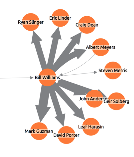
Each review is shown as a node with node color (red to green) indicating the review rating.

Associated with each review are three pieces of information: The business reviewed (building icon), the IP address used (computer icon), and the device provided (@ symbol icon). Reviews flagged by the system as suspicious use a heavy red link, instead of the default blue. Reviews previously removed as fraudulent show as ghosted red ‘X’ nodes.

review fraud 3

One IP address has been used to submit seven reviews about a single business, using four different devices. Three reviews have already been removed as fake.

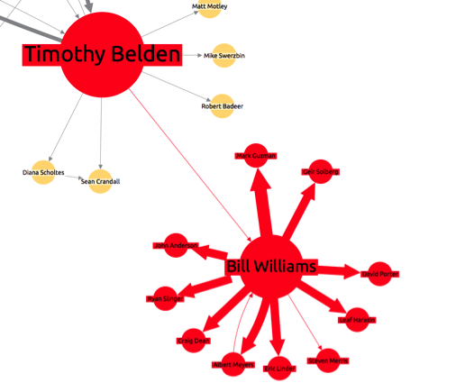
The timing and shared IP address of the remaining four means they are also likely to be false. If we expand outwards on one of the deleted reviews, we see more clues of a possible attempt to manipulate ratings:

Review fraud 4

This time, one device has been used to submit eight zero-star reviews about a single business, but using 5 different IP addresses (or, more likely, a proxy IP address).

This visualization approach provides a fast and intuitive way to digest large amounts of data, improving the quality and speed of decision-making.

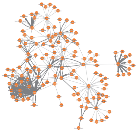
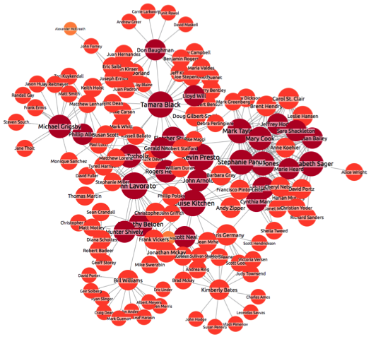
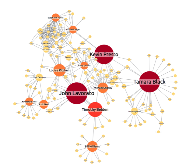
There are many different ways to model review data, depending on the insight you need to uncover. Below we have simply shown three elements of the data:

  1. The reviewers account (person nodes)
  2. The businesses being reviewed (building nodes)
  3. The review rating (green –> red links)

Review fraud 5

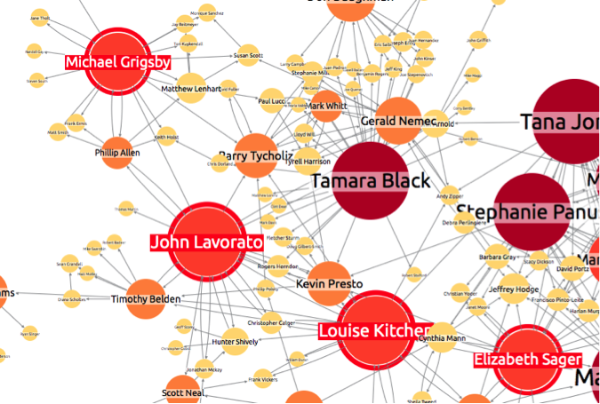
Again, patterns instantly begin to stand out – not least the incredibly positive reviewer in the bottom left who has left dozens of 5-star reviews for many different establishments. Could he be part of an ‘Astroturfing’ network? Looking at the timing of the reviews, and the locations of the businesses being reviewed, would give some good insight.

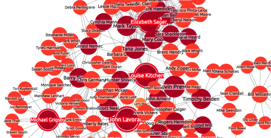
Also of interest is a cluster in the middle:

Review fraud 6

We need to question why one business has received multiple 1-star reviews from accounts that do not seem to have any other activity – a behavior we have identified as potentially indicating fraud.

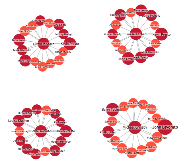
These are just two possible ways of modeling and visualizing the data. Each approach will highlight different aspects and behaviors.

More about KeyLines

To find out more about KeyLines, or to learn how you could integrate a powerful web-based graph visualization component into your existing fraud-detection platform, just get in touch.

Download Guide Contact Us

The post Clamping down on review fraud appeared first on .


Introducing KeyLines Geospatial

$
0
0

Last summer saw the launch of the KeyLines Time Bar, unlocking a whole new dimension to your users connected data visualization.

Today, we’re proud to announce KeyLines 2.7.1 – including another major enhancement to KeyLines Professional Edition to take your data analysis to the next level: KeyLines Geospatial.

KeyLines Geospatial - map network transition - condensed

See your graph data on maps

With our new mapping integration, you can provide your users with an intuitive way to view their geospatial graph data, without losing sight of the connections. Switch seamlessly from a conventional KeyLines chart to Map Mode, and zoom to the granular level of detail you need:

KeyLines Geospatial zoom

Integrate KeyLines Geospatial with other KeyLines functionality, including the time bar, filters and social network analysis, to provide the powerful graph visualization tool your users demand:

KeyLines geospatial filters

We need your input!

KeyLines Geospatial is currently an Alpha component, and we need your input to put it into Beta. Take a look at the API and two new demos in the KeyLines SDK (Demos > Maps) and let us know your thoughts: support@keylines.com.

Other improvements in v2.7.1

KeyLines Professional Edition:

  • Radial layout – we’ve worked to improve the stability of the radial layout – so nodes will move around less when it is re-applied.
  • Link behavior – we’ve made minor changes to the way links behave, making their default behaviour more user friendly.
  • API Changes – we’ve added a new parameter to chart.filter, giving details of the items shown and hidden, and added a new touchdown event for the time bar.

All Editions:

  • Hand Mode – we have altered the implementation of hand mode. In previous versions of KeyLines, dragging the background to pan around the chart would have cleared the chart selection. Now you can choose whether you would like this behavior or not. See the Change Log for details.
  • Documentation improvements – we have improved the clarity of documentation throughout the SDK, including a significant enhancement to the Neo4j demo to make it easier to get started with a new project.
  • Minor amendments – we’ve applied a number of performance enhancements and bug fixes. See the Change Log for details.

The post Introducing KeyLines Geospatial appeared first on .

Build a graph visualization iPad Application

$
0
0

KeyLines app buttonOne of the great things about HTML5 canvas – the rendering engine at the heart of KeyLines  – is its compatibility with all modern browsers. Any graph visualization application you build with the KeyLines toolkit can be easily made available to users through mobile devices like smartphones and tablets.

Many KeyLines developers choose to simply direct their mobile users to a URL where the KeyLines app is hosted. This allows a central control of the application and a consistent experience to users across all devices.

However, if you’re planning on integrating KeyLines into applications targeted at specific mobile device users, an alternative approach could be to package KeyLines into your mobile app. This would give you the opportunity to utilise native controls and make the KeyLines application look and feel like a native mobile application.

Let’s look at how you can get started with one of these mobile apps by building a graph visualization app for iPad, using the KeyLines toolkit.

We’re going to just use a very simple graph visualization example to demonstrate the core aspects of embedding KeyLines into the App and then communicating between the native interface controller to the KeyLine JavaScript API.

Step 1: Create the KeyLines JavaScript Controller

Once you have your login details for the KeyLines SDK (contact us to get access), we recommend taking some time to read the Getting Started documentation and downloading the relevant files.

We’re going to be using the iOS WebView control, which supports HTML5 canvas, so we only need to download our JavaScript files.

This code snippet shows a very simple KeyLines “hello world” graph visualization example.

<html>
  <head>
    <link rel='stylesheet' type='text/css' href='css/keylines.css'/>
    <script type="text/javascript" src="js/keylines.js"></script>
    <script type="text/javascript">
      var chart;

      function klReady(err, charts) {
        chart = charts
        
        chart.load({
          type: 'LinkChart',
          items: [
            {id:'id1', type: 'node', x:100, y: 150, t:'hello', c: '#B9121B'},
            {id:'id2', type: 'node', x:400, y: 150, t:'world', c: '#B9121B'},
            {id:'id1-id2', id1: 'id1', id2:'id2', type: 'link', d: { count: 20} , a2: true, c: '#4c1b1b'}
          ]
        });
      } 

      window.onload = function () {
        KeyLines.paths({assets: 'assets/'});
        KeyLines.create('kl', klReady);
      };

    </script>
  </head>
  <body>
    <!-- The HTML element that will be used to render the KeyLines component -->
    <div id="kl" style="width: 1024px; height: 768px;" ></div>
  </body>
</html>

Step 2: Create the Xcode Project for your iPad app

Next, let’s start Xcode and create an iOS Single View Application project for our KeyLines graph visualization application. For this project we have chosen Swift as the development language and we’re going to target the application just for the iPad.

ipad app 1

Once the project is created, let’s move the KeyLines files to the project directory and use the Xcode File->Add Files To menu option to add them to the project. So, our project should now look something like this:

ipad app 2

Now lets add the WebView control and load up our JavaScript file. Add the following to the ViewController.swift file.

import UIKit
import WebKit

class ViewController: UIViewController {

    var myWebView = WKWebView()
    var myParamView = UIView()
    
    override func viewDidLoad() {
        super.viewDidLoad()
        // Do any additional setup after loading the view, typically from a nib.
        initialise()
    }
    
    override func didReceiveMemoryWarning() {
        super.didReceiveMemoryWarning()
        // Dispose of any resources that can be recreated.
    }
    
    func initialise() {
        addWebView()
    }
    
    func addWebView(){
        myWebView = WKWebView(frame: self.view.frame)
        // Loading the index.htm file into the webview
        let localfilePath = NSBundle.mainBundle().pathForResource("index", ofType: "htm", inDirectory: "keylines")
        let myRequest = NSURLRequest(URL: NSURL(fileURLWithPath: localfilePath!)!)
        myWebView.loadRequest(myRequest)
        self.view.addSubview(myWebView)
    }
}

Things to note from the above:

  • We’re going to use the WKWebView from the new WebKit (this was introduced with iOS 8) as it offers a significant performance improvement over the old UIWebView in UIKit
  • We’ll load the index.htm from the local bundle directly into the WKWebView, so should be able to see our KeyLines visualization straight away.

If you build and run this in the “iPad 2” simulator you should see the following:

ipad app 3

That was easy!

Step 3: Add Some iOS Native Controls

Now lets add a native iOS control and manage the communication to our KeyLines JavaScript controller.

First, we’re going to add a new function to our KeyLines JavaScript (add this into the HTML page within the script tag), which will enable us to toggle link widths.

function showLinkWidth(show) {
   var links = [];
   chart.each({type: 'link'}, function(item){
       links.push({id: item.id, w: show ? item.d.count : 1})
   });
   chart.animateProperties(links, {time:300} );
}

Now we need to add a native control to Xcode project and hook that up to calling this invoking this new JavaScript function.

Let’s start by adding a UIView onto our WKWebView and then adding a UISegmentedControl. You could do this through the Xcode’s Interface Builder but as it’s only one control we’re going to do this programmatically. Add the following method to your ViewController.

    func addOnOffToggle(){
        // Our container for the toggle
        var containerView = UIView(frame: CGRectMake(10.0 , self.view.bounds.height - 50.0, 120.0, 50.0))
        self.view.addSubview(containerView)
        
        // Add toggle segmented controls
        myToggle = UISegmentedControl(items: ["Off", "On"])
        myToggle.frame = CGRectMake(10.0, 10.0, 100.0, 30.0)
        myToggle.selectedSegmentIndex = 0
        myToggle.backgroundColor = UIColor.whiteColor()
        myToggle.addTarget(self, action: "callToggleChange:", forControlEvents: .ValueChanged)
        containerView.addSubview(myToggle)
    }

When the UISegmentedControl is actioned it will call the callToggleChange method, so let’s add that as well.

    func callToggleChange(sender:UISegmentedControl!)
    {
        var title = myToggle.titleForSegmentAtIndex(sender.selectedSegmentIndex)!
        var val = title == "On"
        // Here we’re calling the JS function from Swift!
        var js = "showLinkWidth(\(val));"
        myWebView.evaluateJavaScript(js, completionHandler: nil)
    }

You will see here that we are creating a string that represents a call to the JavaScript showLinkWidth function we defined above. Then using the evaluateJavaScript method on our WKWebView, we can evaluate that JavaScript, which will then toggle the display of line widths.

ipad app 4

That’s it. We now have an iOS App with native controls that controls our KeyLine JavaScript controller.

Step 4: Two-way communication

One of the natural extensions that you may also want to make, would be to allow communication the other way. WKWebView has significantly improved the communication from the web to the app with message handlers. So, if you want to implement two-way communication (between your web and app) then you’ll need to look there.

Build your own graph visualization web application

Obviously, this is just a starting point. There’s still work to do to design our graph visualization, but in a short space of time we have successfully build an iOS App containing a KeyLines chart.

To give it a go for yourself, or to trial the KeyLines graph visualization SDK, just get in touch.

The post Build a graph visualization iPad Application appeared first on .

KeyLines News – May 2015

$
0
0

Data connections are your key to understanding graph data. But what about those other properties of your connected data that a traditional node-link diagram simply cannot easily convey?

Last week, we announced KeyLines 2.7.1, including KeyLines Geospatial – the best way to unlock your geospatial graph data.

Read More »

Updates you might have missed

Our quick run-down of the blog posts and news stories you may have missed in the last month:

Meet the Team

Cambridge Intelligence is growing! Here’s a few of our latest new faces…

Ed – Product Manager
Ed will be leading Keylines as the product manager, making sure it continues to exceed our customers’ needs and expectations.
Zoë – Developer
Zoë joins the dev team, bringing an eye for UX perfection and more than a decade of experience in software engineering.
Teresa – Test Engineer
Teresa has taken on the task of coordinating KeyLines testing, keeping everything consistent and bug-free across all your devices.


If you prefer to meet us in person, check out our events calendar to see where we will be over the next few months.

Best wishes

The KeyLines Team

The post KeyLines News – May 2015 appeared first on .

Visualizing OrientDB with KeyLines

$
0
0

As more and more businesses wake up to the opportunity buried in their connected data, interest in graph databases has sky rocketed.

The availability of an efficient way to store and query connected data has made graph databases a viable option for a range of tasks that would previously have required massive computational resource.

As with all great things, however, there is a limitation to what they can do.

Graph databases, whilst highly optimized for connections, are generally not good for documents. A deployment requiring both would normally need some kind of integration (e.g. Neo4j with MongoDB).

On the other hand, relational and document stores are great for documents, but fairly awful with connected data. The workaround here is a painful combination of foreign keys and expensive join operations.

Connections and documents without a tradeoff?

One potential solution to these woes is OrientDB.

Describing itself as “the first multi-model open source NoSQL DBMS”, OrientDB has full native graph capabilities, but also features you would normally only find in document databases. In theory, it can replace products in Graph, Document, Key/Value, or Object categories.

Like other graph databases, OrientDB stores data as nodes and edges. Data can be stored with or without a schema (or with a partial schema) and relationships can be traversed at lightning speed. However it can also embed documents, meaning they can effectively be stored, not just connected.

OrientDB visualizationVisualizing OrientDB

OrientDB comes with its own graph query language (an extension of SQL) and also a basic visualization tool, but we were curious to see how it would work with KeyLines.

Download our Getting Started Guide for step-by-step instructions on hooking KeyLines up to your OrientDB database. You’ll also need our free 21-day trial of KeyLines.

Download Case Study Free Trial


Getting Started Guide Contents

Introduction

  • What is a graph database?
  • What is OrientDB?
  • Why visualize OrientDB?

Visualization Architecture

  • Benefits of the KeyLines/OrientDB architecture

Getting started with KeyLines

  • Connecting your OrientDB database to KeyLines
  • Embed KeyLines in a web page
  • Querying your OrientDB database
  • Parse the result into KeyLines’ JSON format
  • Layout the graph
  • Customize your chart

Example: An OrientDB / KeyLines demo

The post Visualizing OrientDB with KeyLines appeared first on .

Kantwert – Bringing clarity to networks of influence

$
0
0

kantwert networkSocial connections dominate our lives. Networks of important people – politicians, business people, etc – have huge influence over the world we live in. For businesses, being able to understand these social networks of influential people can be the key to success.

A clear picture of these networks of influence can provide marketers with connections to thought leaders, sales teams with a direct route to decision makers and researchers with a wealth of previously buried intelligence.

We recently worked with Kantwert GmbH, a German company that aims to make these networks of influence more transparent.

Their platform collates and enhances a database of over 3 million German directors and politicians, using a rule-based approach to detail more than 32 million relationships between them.

Using a KeyLines-build network visualization GUI, Kantwert have been able to make these connections more accessible than ever.

Download a copy of the case study to find out more.

Download Case Study


The post Kantwert – Bringing clarity to networks of influence appeared first on .

The Joy of Software Architecture

$
0
0

We were shocked – horrified, in fact – to learn that Software Architecture isn’t everyone’s idea of a good time. There are few things we enjoy more than exploring the structures and systems working inside an application, but reluctantly admit that probably makes us the exceptions.

KeyLines’ architecture is, however, a topic we get a lot of questions about, from developers and non-technical people alike.

For that reason, we thought we would summarize the five things you should know about the KeyLines’ architecture. Feel free to leave any questions in the comments section.

1. It’s fully customizable

KeyLines gives your developers the ability to construct a visualization tool custom to your specific requirements.

Everything, including the chart appearance, user interface and workflow, can be changed and entire functions can be added or removed with just a few lines of code.

For the developer: KeyLines exposes a full JavaScript API of network visualization and analysis functionality. You write some customization code (examples in the SDK) that calls API functions and passes the nodes and links back as JavaScript objects. You can also add cool UI elements from whichever third-party components you like. We have example of JQuery and JQuery UI in the SDK.

The result is you get to build the exact application your users need, without the hassle and caffeine-fueled nights usually associated with such an endeavor.

2. It’s very compatible

KeyLines applications run in any browser on any device. Depending on which browser it is accessed from, users will either see an HTML5 or Flash version of the visualization and won’t notice any difference in how it looks or behaves (although, the older Flash technology is often slower than JavaScript).

This means anyone can access KeyLines, even the users stuck on outdated legacy browsers.

For the developer: To render your charts, you can configure HTML5 Canvas or Flash, or let KeyLines decide which option is best. Only the version needed is fetched from the server, so wait times and bandwidth aren’t affected. Both versions also use the same API, leaving you free to work out your business logic.

3. The heavy-lifting happens on your machine

When data is sent to the user’s chart, it is temporarily stored on their machine. This means KeyLines can perform all kinds of processes and analysis without calling back to your database – filtering, SNA, layouts, grouping, etc.

This gives KeyLines excellent speed and performance, making the end-user experience extremely interactive without putting undue pressure on their machine or the wider IT infrastructure.

For the developer: KeyLines is a client-side application, so the user doesn’t have to wait for server responses to events. Some simple tweaks to customization code can change this behavior, or write-back to the database, if needed.

You don’t need to worry about excessive server traffic, long load times or high latency. Everybody’s happy.

4. Your data is safe

KeyLines is entirely self-contained. No information is sent out and KeyLines’ requires no connection to anything other than what sits on your server and in your database. By keeping everything inside your corporate firewall, you limit the risk of unwanted people getting to your data.

For the developer: All the effort you’ve put into your data security isn’t wasted or compromised by KeyLines. It’s a client-side JavaScript component, and as such it benefits from the browser’s sandbox and doesn’t have any server-side dependencies.

If you want, you can beef up security for extra peace of mind using SSL encryption or a secure HTTP configuration, but it’s usually not needed. Just sit back and take a victory sip of your coffee.

5. It’s easy to scale

KeyLines is a lightweight web application that runs in any browser on any device. There’s no need for dedicated hardware, and the KeyLines files themselves are only around 200k, so they download almost instantly.

KeyLines can be deployed to everyone who needs to visualize connected data without costly IT support, the use of insecure technology or pesky plugins that many users don’t understand.

For the developer: You don’t need to worry about maintaining dedicated visualization servers, running an integration project, anticipating user demand of fielding painful telephone calls about why the Java plugin has crashed. Again.

The post The Joy of Software Architecture appeared first on .

Data Visualization and Cyber Security

$
0
0

ed-woodLast week, we were lucky enough to take part in the Cyber Innovation Zone at Infosec 2015. Our Product Manager, Ed Wood sums up his experience at Europe’s largest information security event.

As a recent recruit to the Cambridge Intelligence team, representing the company at Infosec 2015 was a fairly daunting prospect.

It was a late addition to our events calendar, awarded following a successful “pitch-off” event organized by the Cyber Growth Partnership (a collaboration of TechUK and DCMS).

Our unexpected attendance provided a very welcome opportunity to assess the need for network visualization across the cyber and information security markets.

Network visualization & the Cyber Security use case

Cambridge Intelligence is young but growing company, focused on extracting value and insight from complex data networks. Part of the attraction of the business to me was the broad market appeal and rich numbers of use-cases our technology – KeyLines – can serve.

The data could represent people or machines (nodes), and the phone calls they make or the packets of data passing between them (links).

We had already worked with some exciting companies in the cyber security space, so obviously there was some interest.

But as we set up our modest stand early on the Tuesday morning I really did not know what the next few days would hold. Although, there was always the prospect of a keynote by the controversial Mr McAfee to look forward to, in case stand traffic was slow.

I need not have worried.

Day 1 was a blur of visitors – a few had already made a point of visiting us but many were passers-by who were drawn in by our tagline: “Understand your Connected Data”, or the slick visualizations flashing by on the big screen.

It was clear that the cyber security market is desperate for new and improved ways to visualize their connected data.

The mixed crowd further confirmed our hypothesis.

I met commercial managers, wanting the ‘cool’ factor that visualization brings. I met analytical experts seeking a better way to deep-dive into their connected data. I met developers and CTOs, struggling to create their own visualizations in-house.

All of them understood the value that network visualization could bring.

ed-wood-talk

Product Managers are easily pleased creatures and it was great to get strong and direct feedback on the product from so many people in such a short space of time.

Happily much of this feedback was extremely positive about the capabilities and performance of the product. It was especially gratifying to be able to speak to customers who were struggling to add compelling visualization (using open source tools) and could immediately see that their time and effort could be substantially reduced by adopting KeyLines.

The whole experience – while exhausting – was very satisfying. Even the two presentation were well attended – the appeal of a seat to an exhausted delegate was of course an unrelated factor….

Visualization: Your life raft when drowning in data

But we did get a clear signal that the cyber security market has a strong need for visualization: the richness and complexity and volume of the data that is collected mean that without good visualization, customers and partners risk ‘drowning in data’.

Good visualization empowers good decision-making: whether that’s looking for suspicious human behavior, or patterns of connections between servers or the distribution of files.

If some of the problems I’ve described sound familiar and your application and customers would benefit from powerful but easy-to-integrate visualization we would love to hear from you.

Thank you, again, to UKTI and DCMS for the opportunity to take part, and to the team at Reed Exhibitions / InfoSecurity 2015 for organizing such as great show.

The post Data Visualization and Cyber Security appeared first on .


The Data Science Summit

$
0
0

DSS2015_logo3

Next month, 1000 data scientists will gather in Downtown San Francisco for the Data Science Summit 2015. It is one of the largest shows of its kind – a must-attend event for anyone involved in data science, machine learning or predictive applications.

We have two tickets to giveaway, and thought we would give our friends and customers a chance to win!

How to enter
  1. Follow @key_lines on Twitter.
  2. Tweet us with a summary of how KeyLines has helped you generate data insight.

Bonus points will be awarded for rhyming entries, screenshots, jokes or outright flattery.

We’ll choose our favorite and will announce the winner on Twitter soon afterwards.

Good luck!

The post The Data Science Summit appeared first on .

KeyLines FAQ: Force-directed layouts

$
0
0

time bar networkThe Standard Layout is probably the most underrated tool in your graph visualization armory.

It’s a simple yet effective bit of functionality: a force-directed layout designed to detangle the network and product a clear, aesthetically pleasing visualization.

It is versatile too – regardless of the source of the data in your chart, a standard layout will bring some clarity. More often than not, applying a standard layout is the first action taken by a user faced with a new dataset.

The forces of force-directed layouts

There are three physical forces involved in positioning the nodes and links in a standard layout:

  1. Repulsion
  2. Springs
  3. Network energy

In the model, nodes are treated like charged particles that produce a repulsive force that moves them apart.

This force is inversely proportional to the square of the distance between them – so if they are close together, the force moves them apart strongly, but if they are far apart then it only has a weak effect.

Next, the springs ‘pull’ the nodes closer. Each spring has a certain natural length (controlled by the tightness layout option). If the spring is ‘stretched’, it will pull the node closer to the link end. If the spring is loose, the node is pushed away from the link end.

Finally, we add some energy to the system by setting each node to move in a random direction.

The layout simulates this system for a short while, gradually reducing the energy until a mechanical equilibrium is reached (i.e. the nodes settle in a stable configuration).

Of course, this happens very quickly:


standard layout 1

What about singleton nodes?

Good question. Singleton nodes have repulsive force and energy, but no springs – so surely they simply fly from the chart?

The KeyLines standard layout algorithm considers each group of disconnected nodes separately, and runs the algorithm on each group in isolation. A separate “packing” algorithm then takes all the disconnected groups and packs them together on the chart so that they fit reasonably closely without leaving large gaps between them.

Which is why you might see charts like this:

Standard layout with singletonsWhy have a static force-directed layout?

Some force-directed algorithms do not reduce the system energy as quickly as KeyLines. The result is a ‘floating’ network of nodes and links.

In our view, this is frustrating (waiting for a layout to stop before inspecting the network) and can induce seasickness.

How does it deal with dynamic networks?

The KeyLines Tweak layout is the dynamic variation of the standard layout. It uses the same force-directed model, but with less energy in the system.

The result is an equilibrium is reached more quickly and the node positions can be adjusted in a more incremental way:

Tweak

The nodes don’t tend to move far from their original position, making the network’s evolving structure easier to track.

Visualize your own connected data!

If you have connected data and would like to visualize it for yourself – give it a go!

You can register for a free trial, or get in touch for a personalized demo of the KeyLines network visualization toolkit,

The post KeyLines FAQ: Force-directed layouts appeared first on .

Visualizing your Geospatial Graph Data – Part 1

$
0
0

A couple of month’s ago, we launched KeyLines 2.7.1. Behind the inconspicuous name was one of our most anticipated pieces of functionality yet – KeyLines Geospatial.

For some time, our customers had been requesting a way to understand geographic trends in their graph data.

Our existing automated layouts – although highly effective at uncovering trends in connected data – struggled to convey geolocational patterns.

KeyLines Geospatial – currently in Alpha release, and due for Beta release next month – is a stylish, simple yet effective way to visualize both the locational, and the connective, aspects of geospatial graph data.

Instead of positioning nodes in a layout by their X and Y properties, they can be positioned on top of a map by their latitude and longitude, complete with links.

It works just like any other map, with pan and zoom. Users can also transition from Map View to Network View with the click of a button, and incorporate other KeyLines functionality like Time Bar or Filters:

mapping gif

KeyLines Geospatial is possible thanks to the integration of Leaflet – a popular open source JavaScript library for mapping.

Adding Geospatial to your app

Adding support for maps in your existing applications is easy.

All you need is to include the Leaflet javascript library (available via the Download page in the SDK) on your webpage and provide the longitude and latitude positions for each node, e.g.

var chart = {
 type: 'LinkChart',
 items: [
   {
     id: 'node1', t: 'label', type: 'node', u: 'person.png', x: 100, y: 150,
     pos: {
       lat: 52.2022,    // Must be in range -90 to 90
       lng: 0.1282      // Must be in range -180 to 180
     }
   }
 ]
};

Now you can easily switch between the existing graph layout and the map.

Customizing the map

One of the big attractions of Leaflet is its ability to display map tiles from any 3rd party collection. These tiles are what gives the map its look, it can range anywhere from a simple overview of countries, towns and cities to satellite imagery.

By default it is already setup to provide all the functionality you need but if you want to customise it, all you have to do is pass in the new map style settings into KeyLines and it will do the rest.

Mapping styles

Heres an example of how to use tiles from OpenTopoMap.org:

chart.map().options({
     tiles:{
          url:'http://{s}.tile.opentopomap.org/{z}/{x}/{y}.png', 
	  maxZoom: 16,
	  attribution: 'Map data: © 
	       <a href="http://www.openstreetmap.org/copyright">OpenStreetMap</a>, 
	       <a href="http://viewfinderpanoramas.org">SRTM</a> | Map style: © 
	       <a href="https://opentopomap.org">OpenTopoMap</a> 
	       (<a   href="https://creativecommons.org/licenses/by-sa/3.0/">CC-BY-SA</a>)'
     }
});

It’s that simple!

Try it yourself

Are you intrigued to find the patterns in your graph data?

You can register for a free trial, or get in touch for a personalized demo of the KeyLines network visualization toolkit,


The post Visualizing your Geospatial Graph Data – Part 1 appeared first on .

KeyLines FAQ: Layouts Part 2

$
0
0

A few weeks ago, we wrote a blog post about force-directed layouts. We took a brief look ‘under the hood’ at the forces at work each time the Standard Layout runs.

In this post, we’re going to look at the other KeyLines automatic layouts. Feel free to post questions at the end.

Structural Layout

This is actually KeyLines’ third ‘force-directed’ layout.

Instead of running the simulation of the three forces (repulsion, springs and energy) straight off, it first bunches nodes together according to the structure of the network, i.e. nodes connected with the same set of nodes are grouped:

structural layout

Once the groups of nodes have been made, then the force-directed algorithm runs, but operating on the groups instead of on individual nodes.

This positions each group of structurally-similar nodes together, which helps to reveal the structural composition of the graph. A great way of finding node communities:

structural layout

Hierarchy layout

The hierarchy layout takes a different approach from the force-directed layouts – one that will be familiar if you have seen a family tree.

Here the idea is to place nodes in a hierarchical tree structure, starting from a particular node or nodes – specified by the ‘top’ option.

The other nodes are placed in layers below the top node – the layer for each node is simply determined by how many links away it is from one of the top nodes.

Within each layer, the algorithm sorts the nodes into an order that tries to give a good-looking result, and adjusts their horizontal positions to fit the network structure.

hierarchy layout

The hierarchy layout can produce different orientations, but this simply involves rotating the top-down result as required.

The Radial Layout

Finally the radial layout is a variation on hierarchy.

It uses the same hierarchical structure, but instead of placing the layers in rows one after the other, it places them on concentric rings, with the ‘top’ nodes in the middle.

This can be a great alternative to the hierarchy layout if you have a lot of nodes in each ‘generation’:

radial layout

Visualize your own connected data!

If you have connected data and would like to visualize it for yourself – give it a go!

You can register for a free trial, or get in touch for a personalized demo of the KeyLines network visualization toolkit,

The post KeyLines FAQ: Layouts Part 2 appeared first on .

KeyLines News – Making the Most of KeyLines

$
0
0

Since the release of KeyLines v1.0 back in February 2011, the toolkit has grown and developed almost beyond recognition. Each new version has brought new functionality and better, more advanced methods to understand your complex connected data.

In the coming weeks, KeyLines v2.9 will be released – designed to make the software development kit easier to navigate and use – helping you build the best network visualization application possible.

Mapping styles

Make the Most of KeyLines

If you’re looking for ideas, tips and advice about building with KeyLines, our blog is a great resource. Here’s some content from the past month – and further in the archives – you may have missed:

  • New: Layouts Part 1: Force-directed layouts ‘under the hood’ Read now »
  • New: Layouts Part 2: Structural, Hierarchy and Radial Read now »
  • Getting data into KeyLines Read now »
  • Building a Great Network Visualization Read now »
  • The Ten Rules of Great Graph Design Read now »
  • New: Getting Started with KeyLines Geospatial Read now »

Keep an eye on our blog or follow us on Twitter for news about KeyLines 2.9.

Cambridge Intelligence at the Palace

Earlier this week, representatives from the Cambridge Intelligence team took a trip to Buckingham Palace for a reception with The Queen and The Duke of Edinburgh.

Find out why »

Cambridge-Intelligence-at-Buckingham-Palace-1024x10241

Show Round-up

Next week, San Francisco will play host to 1000 data scientists from all over the world at the Data Science Summit. The Cambridge Intelligence team will be demonstrating the KeyLines toolkit, and taking about graph visualization during the Graph Analytics Session.

Tickets are still available. Save 15% with this link.

More interested in NoSQL? Take part in our extended Graph Visualization tutorial on Thursday morning at NoSQL Now. Quote ‘Lanum’ to save 15% on tickets

Looking for something new?

We are recruiting tech-savvy Sales people to take help customers understand their connected data. Read More »

The post KeyLines News – Making the Most of KeyLines appeared first on .

Using Social network analysis measures

$
0
0

Working as an intern for Cambridge Intelligence over summer, I couldn’t wait to get into KeyLines and see what it could do. I decided I’d write a blog post to share one of my experiences with using some of the more advanced functionality in KeyLines.

Introducing the Enron Email Corpus

In 2003, the Federal Energy Regulation Commission published 1.6 million emails sent and received by Enron management between 2000 and 2002. Research scientists at MIT then purchased the dataset and set about tidying, reformatting and de-duplicating it for public use.

We took this data and loaded it into KeyLines. Today I’m going to use the Enron demo to try and reverse engineer some of the investigation and to understand the management structure of the organisation using social network analysis.

Contact us to get access to our SDK to try it yourself.

Visualizing the network topology

Upon opening the demo, I can see that the nodes represent people within the Enron corpus and the links between them are incoming and outgoing emails.

enron network visualization 1

I can see the overlying structure of the organisation’s communication and that there’s a tightly-knit cluster tangled up in the top left. Let’s switch “email volume” on:

enron network visualization 2

Showing email volumes really highlights the tightly connected area on the left of the network. But there also seems to be some smaller communities on the edges of the network map. For example, Bill Williams on the far right hand side:

enron network visualization 3

We can assume that Bill is some kind of team manager. But it seems strange that he has only a single stream of communication coming from the larger network and communicates only with nodes that are isolated from the core network. This seems a good place to start.

Finding a starting point

A quick Google search reveals that Bill was directly involved with manipulating energy production to fraudulently benefit Enron executives. He was heard in court via a recording instructing a high level member of staff from a power station to deliberately withhold power and make up an excuse for doing so, causing blackouts for thousands of homes throughout California.

Using network links to trace connections

I can exploit that knowledge in an effort to find more through Bill’s relationships. If I click on the node, I can highlight his immediate connections from the rest of the network.

enron network visualization 5

This shows that Bill is connected to the wider network through only one other person; Timothy Belden. Reports tell us that Bill was a senior trader – on the assumption that he wasn’t acting alone, his connection to Timothy Belden seems quite suspicious and the emails between them become of importance to the investigation, as they may offer a lead to potential associates of Bill.

The importance of connections

It seems KeyLines has already highlighted the alleged “mastermind” behind Enron’s Californian scandal. The connection between Bill and Timothy now becomes of even more significance – whilst Network Visualisation alone can’t prove or disprove guilt, it saves what could have taken weeks sifting through emails to identify who was talking to who, and allows investigators to spot hidden structures of communication within the network.

Now let’s try something a little more advanced…

Using SNA to identify different positions in a hierarchy

I’m going to see if I can use KeyLines to locate important people in the company (or at least the person at the top of the hierarchy within the network).

Degree centrality

Degree centrality is purely a measure of how many direct connections a person/node has. In this demo, higher degree centrality is associated with bigger node size and darker color. Someone at the top of the chain of command is probably likely to have a fair few connections, but not the most. They should only be talking directly with ‘department heads’ or equivalent.

Lets take a look at the network with degree centrality switched on:

enron network visualization 6

At first glance Mark Taylor and Tana Jones look like important people, but the volume of connections they have suggest they actually occupy roles distributing information, such as internal communications. I think our main suspects for senior management now are Michael Grigsby, John Lavorato, Louise Kitcher and Elizabeth Sager. The others of the same size seem too closely intertwined with the group on the right of the map.

enron network visualization 7

Closeness Centrality

Closeness centrality is a measure of how close a node is to every other node in the network. Using this feature in the KeyLines demo, a node is sized and colored based on the cumulative amount of degrees it is away from all other nodes. Let’s take a look at our network now:

enron network visualization 8

Ok, that’s a little overwhelming. We’ll stick to the names we dug up from the degree centrality filtration and see how they look here.

enron network visualization 9


I’ve highlighted the names I selected previously. They all show a high level of closeness centrality – something that we would expect to see from a director, as, theoretically, their connections should flow efficiently down the hierarchy. There is, however, one differentiating factor between the four – the closeness of the people in their immediate networks.

enron network visualization 10

As you can see above, the people in John Lavorato’s immediate network have a higher closeness centrality than any of our other potential directors. It makes sense that equally well-connected department heads and managers would surround the director.

Lets see if we can make an educated guess on the Director’s name based on the third centrality measure offered in KeyLines…

Betweenness Centrality

Betweenness measures how well a node connects separate communities within the network. I’d expect to see a higher level of betweenness centrality in a director, as in theory they should have managers from different areas of the business reporting to them and therefore should form a link across different departments. Let’s see if any of our prospective directors match this profile:

enron network visualization 11


Of our original four, John Lavorato seems to have the greatest betweenness centrality and therefore best matches our profile for director, especially given the higher closeness centrality of his immediate network. Let’s see how I did…

Success! Using SNA measures to detect structures within networks

Reports confirm that Lavorato was in fact the chief executive of Enron Americas. There are certainly more efficient ways of identifying the CEO of a company, but this exercise shows how social network analytics and data visualisation can be used to bring out hidden structures in complex connected data, where the hierarchy is not so obvious – for example, when dissecting a fraud ring or pinpointing where the leadership lays in a terrorist sell.

Purely through using KeyLines SNA measures, I was able to pick out the two of the key players in the Enron scandal and isolate the top of the hierarchy. If this exercise demonstrates anything, it is the investigative power of network visualization and analysis.

Contact us or Register for a trial to get access to our SDK and play detective yourself!

The post Using Social network analysis measures appeared first on .

KeyLines 2.9 – Making the developer’s life simpler

$
0
0

KeyLines 2.9 is now live for all our customers and evaluators. Enhancements in this version include:

  • An overhauled SDK and improved resources
  • KeyLines Geospatial enters beta state
  • The ability to use fonts as node and glyph icons
  • New functionality for Starter customers

Overhauling the KeyLines SDK

The best thing about KeyLines is the power it gives our developers to build great visualizations quickly. But as the toolkit grew bigger, better and more sophisticated, the SDK got more and more complex.

Over the past few months, we’ve completely overhauled the KeyLines SDK.

pro-sdk-machine

Next time you login you will find a new look that is easier to navigate. Documentation has been streamlined and new getting started resources will enable you to be productive faster.

Some new resources for you to explore include:

  • New demos (see Dragging, Context Menu, Font Icons and Tooltips)
  • A better ‘Getting Started’ guide
  • Tutorials, developer tips and an extended FAQ section
  • An easier to navigate API reference

Think we’ve missed something? Got an idea for enhancements? Let us know!

KeyLines Geospatial goes into beta

Thanks to everyone who gave their feedback on KeyLines Geospatial during its alpha testing phase. The main improvements you’ll notice in beta are:

  • KeyLines navigation controls are now available in map mode
  • Marquee selection also available in map mode
  • toDataURL serializes both the map and chart image
  • A range of chart API methods are also now available in map mode

For the details, see the SDK Release Log.

Font Icons

This new feature allows you to use fonts as icons for nodes and glyphs, allowing you to create a consistent and stylish look across visualizations:

fonticons

New functionality in KeyLines Starter

We are also pleased to announce that, in addition to the SDK overhaul and font icons, some significant new functionality has been made available in the KeyLines Starter Edition:

  • Halos – add context to your chart with eye-catching halos
  • Ping – draw attention to certain nodes with ‘ping’ – or animated halos
  • Full Screen Mode – allow users to toggle their browser to full-screen mode

Microsoft Edge Support

We’re pleased to confirm that KeyLines 2.9 is fully compatible with the new Windows 10 browser, Microsoft Edge.

Other improvements

A number of other enhancements and improvements have been made, including:

  • A new ‘unbind’ API method and ‘chart hover’ event
  • Performance improvements for hidden items
  • Bug fixes and enhancements

Your feedback is vital

As always, you’ll find full details of the update in your SDK Change Log. If you have any questions or comments, don’t hesitate to get in touch.

The post KeyLines 2.9 – Making the developer’s life simpler appeared first on .


Visualizing Titan – the scalable graph database

$
0
0

687474703a2f2f7468696e6b617572656c6975732e6769746875622e696f2f746974616e2f696d616765732f746974616e2d6c6f676f2e706e67We’ve written before on this blog about the rise of the graph database.

Every day we speak to developers and DBAs excited by the opportunities presented by graph-format data stores, and by graph visualization.

The majority of these people are using Neo4j on the backend, of course. It’s a fantastic database, and one million downloads (and counting) makes them by far the biggest graph database around.

There’s also a smattering from other niche and newer options in the market – InfiniteGraph, OrientDB, even Google Cayley.

But one graph database that has been quietly growing in popularity is Titan.

Why use Titan for your graph project?

Historically, graph databases are terrible at scaling.

With a ‘traditional’ database (relational, key-value, document, column, etc.) horizontal scaling is a breeze. Their tabular, regular structure can shard across a distributed architecture in a consistent and stable way.

The more complex (schema-less) graph model, however, has given graph databases a reputation for being difficult – if not impossible – to scale horizontally. Networks by nature don’t tend towards isolated systems, increasing the likelihood of a look-up needing to perform expensive cross-machine traversals.

As a result, graph databases were sidelined as a niche technology, only useful for small, complex datasets.

The Neo4j team, in particular, has put huge effort into fixing the scalability concerns. Using a master-slave / load balancer architecture with concurrent processing and in-memory page cache, Neo4j 2.2 enjoyed 100x faster write and 10x fast read performance.

But what if there was a graph database designed – from scratch – to scale?

Titan Graph Database – the scalable option

The Titan Graph Database is the first graph database optimized for huge graphs.

A combination of distributed multi-machine clusters, edge compression and vertex-centric indices has given it it massive horizontal scalability. One quote claims it can run to 100bn nodes and tens of thousands of concurrent users.

It is no surprise then that Titan has such an active and enthusiastic community, despite still being in pre-release (v0.9).

And it’s no surprise that DataStax (the firm behind the Cassandra DBMS for enterprise) acquired Aurelius (the team behind the Titan project) earlier this year.

Work has started on a commercial, scalable graph database called DSE graph. We look forward to seeing the results of such a great partnership!

rexster-dog-house-viz
The native Titan visualization GUI

Visualizing Titan with KeyLines

Titan does come with it’s own GUI, designed for graph administration, but what if you need to give your end users a way to interact with the graph?

As a database agnostic solution, KeyLines is a popular option for visualizing Titan databases. It’s also relatively simple – with five generic steps to get data from your Titan database and into a KeyLines chart.

Before you get started, you’ll need to register for a KeyLines trial.

You might also want to download our Getting Started with KeyLines and Titan guide, which will give you more background information.

Download Guide    Try KeyLines

Five Steps for Visualizing Titan

Step 1: Configuration

To get data from our Titan database (on the server), into a KeyLines chart (in the user’s browser) we need to make use of the Rexster API. This transforms data from Titan into a JSON object KeyLines recognizes, and KeyLines’ AJAX requests into Gremlin queries Titan understands.

We also recommend using Apache Cassandra as the data back-end. Process calls are used to communicate between Cassandra and Titan.

You can download Titan, Cassandra and Rexster in one bundle here from the Titan Github pages.

Step 2: Load the graph

This is relatively straightforward, and the Titan team has provided good resources to help you do this: http://s3.thinkaurelius.com/docs/titan/0.5.3/index.html

Step 3: Connect to Cassandra

By default, Titan is set to use an in-memory database rather than the Cassandra database we want to use.

To change this, you’ll need to run this script in the Rexster console:

gremlin> g = TitanFactory.open('conf/titan-cassandra-es.properties') ==>titangraph[cassandrathrift:127.0.0.1] gremlin> GraphOfTheGodsFactory.load(g) ==>null

Step 4: Call the data from Titan

Once Titan is running with a Rexster front end, KeyLines can be told to submit AJAX queries to call the database. The function for this would look something like:

function callRexster(query, callback) {
  $.ajax({
    type: 'GET',
    url: rexsterURL+query,
    dataType: 'json',
    contentType: 'application/json',
    success: function (json) {
      fromTitanToKeyLines(json, callback);
     },
     error: function (xhr) {
      console.log(xhr);
    }
  });
}

Step 5: Load the data into KeyLines

The final step is to run some code that submits a Gremlin query to load your Titan data into the KeyLines chart. This would like this:

function fromTitanToKeyLines(items, callback) {
  var klItems = [];
  $.each(items, function (i, item){
    var klItem;
    if(item._type === ‘vertex’){
      klItem = createNode(item);
    } else {
      klItem = createLink(item);
    }
    klItems.push(klItem);
  });
   // now load it with a nice animation
  chart.expand(klItems, {tidy: true, animate: true}, callback);
}

And that’s it! By this point, you should see a KeyLines chart pulling data from your Titan database.

keylines titan demo
Our Titan demo application in the KeyLines SDK will teach you more about the KeyLines/Titan setup.

Try it yourself

In the KeyLines SDK you’ll find a demo application we’ve built to help you understand the visualization model a little better. Take a look, inspect the source code and see what you can build!

Download Guide    Try KeyLines

The post Visualizing Titan – the scalable graph database appeared first on .

KeyLines FAQs: Building a custom layout

$
0
0

Structural layoutOne of the best things about KeyLines is its customization. Every aspect of a KeyLines application can be adapted to meet the needs of your users, and the peculiarities of their data.

But KeyLines is also incredibly extensible. With some JavaScript knowledge and a little bit of work, you can integrate 3rd party libraries or build your own functionality to run alongside native features.

The KeyLines toolkit includes six layouts, but there are endless ways of laying out a network – so you might want to implement one of your own.

In this blog post we take a quick look at how you can get started with building your own layout algorithm, defining a neat framework for your code and explaining the best practice approach.

Step 1: Build the foundations

We’ll start simply with an empty JavaScript file, called newLayout.js. Later on we will import this into our webpage.

Next we’ll create a function, called newLayout, to go into our empty file:

function newLayout(chart){
 // Here we will write functions that are required to perform the layout
 // Such as copyInformationFromGraph and updateGraph 

  function layout(){
	// The code written here will be executed when the user writes
	// var myLayout = newLayout(chart);
	// myLayout.run();
 }

 return {run:layout};

}

Step 2: Copy the data into local tables

The next step is to implement a function that copies our graph data into local tables. We do this using the function copyInformationFromGraph(). This will store our node data in ListNodes.

We could just work directly on our local variables (using chart.getItem followed by chart.setProperties) but this approach is cleaner and more efficient.

var listNodes; // add listNodes as a global variable defined in newLayout !
 function copyInformationFromGraph(){
   listNodes= [];
   chart.each({type:'node'}, copyItem);

   function copyItem(item){
     if(item.hi){
       return;
     }
       listNodes.push({id:item.id, x:item.x, y:item.y});
     }
   }

Step 3: Modify the coordinates

Once we have all the information in listNodes, our layout code will modify their coordinates values, which dictate where they appear on the chart. A function called updateGraph will update the chart once the layout is complete:

 function updateGraph(){
   var listChanges = [];
   var k;
   for(k=0; k < listNodes.length; k++){
     listChanges.push({id:listNodes[k].id, x:listNodes[k].x, y:listNodes[k].y});
   }
   chart.animateProperties(listChanges);
 }

Step 4: Write your custom layout code

Now it’s up to you to write your own layout code in the function layout.

For example, to build a simple layout that displaces nodes randomly, just insert the following code in the function layout():

copyInformationFromGraph()
for(var k=0; k < listNodes.length; k++){
 listNodes[k].x += 10*(0.5 - Math.random());
 listNodes[k].y += 10*(0.5 - Math.random());
}
updateGraph();

Step 5: Run your layout

Simply:

var myLayout = newLayout(chart);
myLayout.run();

And the result:

custom layout 1

Getting more adventurous…

Now we have our basic framework in place, we can try some more advanced operations.

In the spirit of the force-directed layout let’s write a layout that will compute electric forces between nodes.

The value of the force along the x-axis and the y-axis will be stored in listNodes (listNodes[k].fx and listNodes[k].fy).

A function called computeElectricForces will compute the value of these forces and a function applyForces will update the coordinates of the nodes accordingly.

Our new code looks like this:

function newLayout(chart){
var listNodes;
  function copyInformationFromGraph(){
   listNodes= [];
   chart.each({type:'node'}, copyItem);

   function copyItem(item){
     if(item.hi){
       return;
     }
       listNodes.push({id:item.id, x:item.x, y:item.y, fx:0, fy:0});
   }
 }

 function updateGraph(){
   var listChanges = [];
   var k;
   for(k=0; k < listNodes.length; k++){
     listChanges.push({id:listNodes[k].id, x:listNodes[k].x, y:listNodes[k].y});
   }
   chart.animateProperties(listChanges);
 }

 function computeElectricForces(){
   var k1, k2;
   var coefficient = 2*1e5;
   for(k1 = 0; k1 < listNodes.length; k1++){
     for(k2 = 0; k2 < listNodes.length; k2++){
       if(k1!==k2){
         var deltaX = listNodes[k1].x - listNodes[k2].x;
         var deltaY = listNodes[k1].y - listNodes[k2].y;
         var r = Math.sqrt(deltaX*deltaX + deltaY*deltaY);
         var forceStrengh = coefficient / (r*r);
// r is the distance between two nodes. In order to project the force along the x-axis and the y-axis
// we multiply forceStrength by (deltaX / r) and (deltaY / r) which correspond to the cosine and
// the sine of the angle between the two nodes and the x-axis and y-axis
// Notice that if r = 0, i.e. if two nodes are stacked, then our code does not work: it’s up to you to
// find a solution for that (for example, shaking the nodes’ positions if such a case occurs)

         listNodes[k1].fx += forceStrengh*(deltaX / r);
         listNodes[k1].fy += forceStrengh*(deltaY / r);

       }
     }
   }
 }

 function applyForces(){
   var k;
   for(k = 0; k <listNodes.length; k++){
     listNodes[k].x += listNodes[k].fx;
     listNodes[k].y += listNodes[k].fy;
   }
 }

 function layout(){
   copyInformationFromGraph();
   computeElectricForces();
   applyForces();
   updateGraph();
 }

 return {run:layout};

}

When this layout is applied to the same graph, we get the following result:

custom layout 2

Further improvements

Our algorithm is still pretty basic here. There are plenty of ways to improve it, for example:

  • Using spring-like forces between connected nodes, pulling them back into each other
  • Including a loop to compute positions and update the network accordingly
  • Using forces to modify the speeds of nodes, rather than their positions.

A huge number of other improvements have been developed by the graph drawing community. We’ll make sure we follow this post up with some of them soon!

Try it yourself

Do you have a great idea for a layout? Get creative and try it for yourself!

Try KeyLines!

The post KeyLines FAQs: Building a custom layout appeared first on .

Making your life easier

$
0
0

Making the developer’s life easier is a task we take pretty seriously here at Cambridge Intelligence HQ. We aim to make it as simple as possible to build a custom application that enables your users to visualize, explore and understand connected data.

Last month we took a huge leap forwards when we released KeyLines v2.9, featuring a completely overhauled SDK site and new resources to make building an app with Keylines easier than ever.

What’s new in KeyLines 2.9?

We would love to get your feedback.

Have you found the SDK easier to use? Is the new documentation style simpler to navigate? Let us know how you have got on.

Things you might have missed

Our run down of new resources from the last month that you might not have seen.

  • Visualising Titan – we take a look at how easy it is to hook your Titan graph database up to KeyLines.
  • Building layouts – our developers describe a best practice framework for building a custom KeyLines layout.
  • Investigating Enron – one of our interns takes a look at the infamous Enron email corpus, so see how network visualization and social network analysis can help us understand the relationships inside the former company.
  • The missing dimension to your graph data visualization – Joe Parry at last month’s Data Science Summit.

Developer tips from the archives…

We’ve pulled a few older blog posts out of the archives, written to help make the work of a developers a little simpler:

Meet us on the road

We’ve still got a few more shows left this summer. It would be great to see you there!

The post Making your life easier appeared first on .

Visualizing a Knowledge Graph

$
0
0

Once you start working with graphs, it does not take long before you begin to see them all around you.

This blog post is about one of our recent experiments, looking at the graph structures in Wikipedia articles (via DBpedia) to understand the evolution of music through time.

If you feel inspired, why not try it for yourself? Register for a free KeyLines trial.

What is DBpedia?

DBpedia can be thought of as a machine-readable version of Wikipedia. DBpedia is a huge database built upon structured information found in Wikipedia articles.

DBpedia has a robot that will parse Wikipedia articles and store them in a ‘Semantic Web’ format.

This is great for querying relationships between things and of course data with relationships is often great to visualize in KeyLines!

reggae wikipedia screenshot

Notice how the right hand panel is filled with machine-parseable structured information.

reggae dbpedia screenshot

The DBpedia version of the article, shown here as an HTML table but also available as a JSON object.

Defining SPARQL and RDF Triples

SPARQL is a query language for the Resource Description Framework (RDF) – a data model that describes information as triples of Subjects, Predicates and Objects:

  • A subject is the resource being described in our triple
  • A predicate defines the relationship within the triple
  • An object is something related to the subject, via the predicate

The terminology subject-predicate-object is also used in spoken languages (to describe the three components required to form a sentence) which makes RDF triples a logical format for describing a resource:

  • Subject: A band
  • Predicate: Has
  • Object: A genre

Introducing Ontologies

Another concept of SPARQL (and the semantic web) we need to understand is an ‘ontology’.

An ontology can be thought of as a dictionary of descriptive terms we can use to link things. For example, if we look at the dbpedia resource for ‘The Clash’ (http://dbpedia.org/page/The_Clash), we can see that they have a genre defined as:

visualizing dbpedia 1

The machine representation of this information that dbpedia stores is as follows:

<http://dbpedia.org/resource/The_Clash> 
<http://dbpedia.org/property/genre> 
<http://dbpedia.org/resource/Punk_rock>

Here we are using 2 ontologies: dbpedia.org/resource and dbpedia.org/property ontologies are great because they let us define commonalities between information. We can say that data is linked to other data if they share any of a subject/predicate/object combined with the same ontology.

How to write a SPARQL query for DBpedia

With this knowledge, let’s try writing our first SPARQL query to run on the live DBpedia SPARQL endpoint.

This is a great place to test out your SPARQL skills: http://live.dbpedia.org/sparql.

Let’s try the following SPARQL query:

PREFIX dbo: <http://dbpedia.org/ontology/>
PREFIX dbr: <http://dbpedia.org/resource/>
PREFIX foaf: <http://xmlns.com/foaf/0.1/>

SELECT ?label, ?band
WHERE {
  ?band dbo:genre dbr:Punk_rock .
  ?band foaf:name ?label .
  FILTER (LANG(?label) = 'en')
}

We’ve got four components to this query:

  1. The PREFIX at the top – defining the list of ontologies we use in the query.
  2. The SELECT statement – defining the variables we want to select (these can be any node in the RDF dataset).
  3. The WHERE clause – which in this case is defining a band as something with a genre which is punk_rock. At this stage, we are also saying the label is the name of the band.
  4. Finally, we apply a filter to show only labels in the English language.

When we click ‘Run Query’, we will get back a huge table of every punk rock band found on Wikipedia:

visualizing dbpedia 2

Now, DBpedia and SPARQL can be great fun to play around with, but there’s one thing missing from these huge tables of results: a nice visualization!

Time to build a KeyLines visualization!

Visualizing DBpedia in KeyLines

For this demo, I have something in mind. If you look back at the earlier DBpedia representation of Reggae (Figure 2), you will see that it has some properties ‘derivative’ and ‘stylisticOrigin’.

In the example of a music genre the derivatives will be other genres that were inspired by, or branched from, the original genre. Conversely, the stylistic origin will be genres that influenced the genre in question.

So for every music genre we will have its parents and children – a perfect graph structure!

The first thing to do is to write our SPARQL query:

PREFIX rdfs: <http://www.w3.org/2000/01/rdf-schema#>
PREFIX rdf: <http://www.w3.org/1999/02/22-rdf-syntax-ns#>
PREFIX dbp: <http://dbpedia.org/property/>
PREFIX dbo: <http://dbpedia.org/ontology/>

SELECT ?label, ?genre, ?decade, ?origins, ?derivatives
WHERE {
  ?genre rdf:type dbo:MusicGenre .
  ?genre dbp:culturalOrigins ?decade .
  ?genre rdfs:label ?label .
  ?genre dbp:stylisticOrigins ?origins .
  ?genre dbp:derivatives ?derivatives .
  FILTER (LANG(?label) = 'en')
}
GROUP BY ?label

Then it is easy to write a script, which will send this SPARQL to a URL endpoint and from the JSON returned, create a JSON file.

The URL I hit was as follows:

http://dbpedia.org/sparql?default-graph-uri=http%3A%2F%2Fdbpedia.org&format=application%2Fsparql-results%2Bjson&timeout=30000&query=

After query in the URL I added the URI encoded SPARQL query. The results coming back have the label repeated on multiple lines, so I wrote some small code to parse the response and group each parameter by its label (the genre name).

It is best to save the data you want from DBpedia, that way we don’t have to keep hitting the DBpedia endpoint, which will be both slow for our users and not very nice for the DBpedia service which is kindly hosted by someone else for our benefit.

Presenting the data in KeyLines

Now we have our cleansed JSON file containing all the DBpedia data we need – every music genre found on Wikipedia, listed with the decade it emerged, and its parent/child genres.

Here is what the data looks like when it is first loaded into KeyLines:

visualizing dbpedia 3

Yikes. This graph is a bit chaotic.

I decided to color nodes based on the decade in which they emerged, when the data was available, and size the nodes depending on the genre’s overall influence.

Even so, each node can have a huge number of parents and children, which is what is causing the denseness we see here.

Fortunately, KeyLines makes it really easy for us to add some controls to help in scenarios like these. Let’s try some searches and filtering.

Let’s have a look at all the music genres which were created in the 1970s:

It’s no surprise that the 1970s were a very creative time for music, much of today’s music derives from genres created during that period – hip hop, punk rock, post-punk, etc.

In this view, we can clearly see the influence of post-punk in the 1970s, which influenced or drew influence from, a network of other rock genres.

We can also see less mainstream genres, sitting aside from the main graph as singletons: psychadelic folk, doom metal, cadence-lypso, et al.

Using a hierarchy layout, we can track the influence of genres through the decades. Let’s click on Acid Rock:

acid house

The KeyLines hierarchy layout is a great way to represent this data.

The nodes on the first level were directly influenced by acid rock, further down we can see genres influenced by acid rock’s children. Clicking any of these nodes will allow us to explore further, working through a world of music!

Try it for yourself

DBpedia is a gold mine of knowledge, available for you to explore – whether for fun, or to derive some more meaningful information.

KeyLines is the best way to navigate through the connections and relationships. Give it a try! Register for a free trial:

The post Visualizing a Knowledge Graph appeared first on .

KeyLines FAQS: How to work with the Time Bar

$
0
0

time bar 3
Most connected data has a temporal element. Understanding it can be the key to unlocking a bigger picture.

That is why we built the KeyLines Time Bar.

Whether your data is time-stamped (cyberIT networksfinancial transactions, communications, etc) or manually collated, using the time bar means you can ask more questions:

What is the cause or effect of X? How does an activity develop over time? What is going on in real time?

We take a closer look at the Time Bar, to see how it works and how to incorporate it into your KeyLines applications.

Getting your data format right

We designed the time bar to be easy to use with the KeyLines chart.

You can define your data in KeyLines’ JSON format once and load it into both your chart and the time bar. The time bar will ignore chart-only properties and vice versa.

The important properties for the time bar JSON are ‘dt’ – which is the timestamp as a JavaScript date object or a millisecond number – and ‘id’.

If your data has a value, for example if it’s a transaction, you could also give it a ‘v’ value. This will cause the histogram to represent the sum of all the ‘v’ values, instead of counting the number of items.

Updating the chart to match the time bar

The time bar and chart are independent of each other, but are simple to connect together.

For example, if you want your chart to update each time the time bar range changes:

// When the time bar range changes
timebar.bind('change', function () {
// filter the chart to show only items in the new range
chart.filter(timebar.inRange, { animate: false, type: 'link' }, function() {
// and then adjust the chart's layout
chart.layout('tweak', { animate: true, time: 1000 });
});
});

This code binds to the time bar change event (fired whenever the range changes, e.g. sliders move or the play button is pressed) and performs a chart filter.

The timebar.inRange is a function which takes an object or id and if it finds an item loaded in the time bar model with the same id as well as a dt property in range it will return true, otherwise false.

This format of returning true/false fits in perfectly with the required filter function for chart.filter. Once the filter is complete we call a tweak layout to space out the items on the chart nicely.

time bar dragging

Updating the time bar to match the chart

Another common integration is to show a selection line on the time bar once items have been selected in the chart. KeyLines makes this behaviour easy to achieve.

chart.bind(‘selectionchange’, function () {
	timebar.selection({id: chart.selection()});
});

Here we bind to the chart selectionchange event. Then when this event fires we call timebar.selection which will draw the selection line on the time bar with the specified array of ids (and conveniently chart.selection() gives us an array of ids of all the selected items).

Time bar selections

Customizing the time bar

As a developer, the KeyLines toolkit gives you the freedom to change the visual appearance of any part of the time bar.

Any combination of the scales can be shown or hidden:

time bar - hiding scales

And there is fine-grained control over the localization of the time bar by changing the month/day names and time options:

time bar 2 - time and date localization

There are also a number of different options for changing the color scheme of the time bar, so it can fit in with the rest of your application, or stand out:

keylines color

Feeling inspired?

The KeyLines Time Bar is a powerful bit of functionality, and a great tool to experiment with. If you want to know more about the temporal trends in your dynamic graph data, we’re happy to help.

Download our white paper to learn more, or if you have some JavaScript experience, jump right in with a free trial of the KeyLines SDK:

Download white paper Free Trial

Next time, we will take a look at combining the time bar with KeyLines geospatial, helping you uncover the geographic and temporal trends in your graph data.

The post KeyLines FAQS: How to work with the Time Bar appeared first on .

Viewing all 506 articles
Browse latest View live